Friday 28 February 2014

Elements of the Front Cover - Logo

          I left off designing the logo for my cover as I was unsure what design I was going to go for and what tools I was going to need. Looking at other games within the same genre, skulls, armour, weaponry, and fantastical beasts were among the most popular, and after drawing a few initial designs I find myself returning to the shield design. Armour and weaponry resonate with me as they're a large focus in the fantasy genre across all mediums, as they are often works of art with intricate details that reflect the place or people wielding them. A quick google shows you the level of detail that goes into designing shields for films and games, this is the quality I am aiming for with my design. 
          I used the pen tool (for a vector image) to draw the outline of a shield but quickly ran into problems as I am not very skilled with this particular tool, so I placed an outline of a shield into the document as a template but I was still having trouble getting the lines perfect against the shape so I decided to go with my own design. After a making a basic outline, I started tweaking anchor points and finished with a design that looked completely different to the one I had used as a template but I prefer my design as it encapsulates the idea of fantasy. To prevent inconsistencies with my design, I drew only half of the shield allowing me to flip it horizontally and match it against the other half forming the full shield. Finally, I removed the line in the middle by using the direct selection tool, selecting the line and the pressing delete. 


          Initially I placed the outline into Adobe Illustrator and used the offset tool (Object - Path - Offset patch) to shift the design inwards -1mm.However this didn't create one solid outline, I deleted the offending edges and used the pen tool to draw a line between the anchor points and then tweaked them until they followed the curve of the outer shield outline. 


          I placed the outline back into photoshop and followed this tutorial adapting it to my own design. I did use different textures that I felt fitted my shield and overall design better than the guide's suggestion. To finish I used the soft oil pastel brush to draw over the shield design, this gave some texture to the shield and because I didn't 100% cover the shield, the gaps appear to be marks on the shield giving it a "battle worn" appearance. Although not evident on the picture below, I did add an inner bevel. 
(Smooth technique, 500% depth, down direction, both size and soften at 5px, 90 degree angle, 30 degree altitude, default contour, grey highlight and shadow modes with 80% opacity)


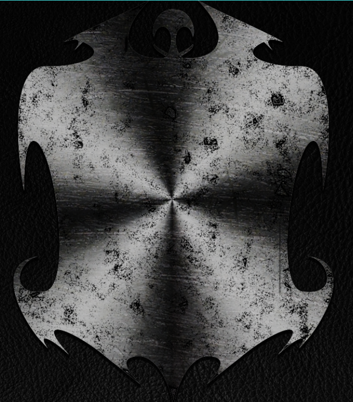
          However,  the lighting doesn't match the rest of my cover, I have lighting at a 30 degree angle whilst this looks as if the light is shining directly in the middle and even after trying to move the reflections around it doesn't look authentic. I have researched making a chrome texture that will reflect an image in a realistic way, if I can create this is will look very realistic and fulfill the image I am trying to achieve. 

Quick google - http://tinyurl.com/qzgvecn
The tutorial - http://abduzeedo.com/captain-america-shield-photoshop

Elements of the Front Cover - Wax

          One of my ideas for creating a typical idea of fantasy was a wax stain on the front cover, as if the book had been sat next to candle and the wax had melted down the side and onto the cover of the book, adding another element of mystery as to the life the book has had. After much searching I found a suitable wax texture and used the selection brush to obtain a natural looking blot. I consulted with a textiles and costume student as to how wax would look after it had dried on black leather, put their advice into practice using a combination of blending modes, colour replacement and lighting techniques to try and achieve a natural looking finish.


          I wanted a seamless, natural look wax splat and I don't feel this filled that criteria so I have decided to abandon this element of my project as it looks to obvious and out of place, therefore taking attention away from the other nuances on the cover which are more important in creating a convincing, natural look. If I come across other techniques during my research that I think will improve the look of the wax then I will explore those options.

Wednesday 26 February 2014

Elements of the Front Cover - Ripped Corner + Claw Marks Update

         One of the main elements I wanted to add to my cover was a burnt/ripped corner revealing the charred page I made before as this would be something that generates interest. I used the eraser tool to chip away at the layer mask to try and create a torn edge but this looked too obvious and therefore didn't look authentic. I downloaded a wrinkled page texture, and used the quick selection brush to outline a corner, this created a natural uneven tear selection. I rubbed out the selection area revealing the charred page that I created before however I felt this also looked too obvious and didn't create the convincing tear I wanted. I found 2 burnt pages on google, cut the edges and placed them above the charred page but below the leather this made it look a lot more realistic, apart from an edge that was too bright so I erased it.


Left - White edge - Right - After erasing


          Having looked at burnt books, my attempt looked too vibrant and didn't have the charred effect I wanted to achieve. I used the smudge tool to tweak parts of the leather cover into places whilst giving it a slight melted look and allowing me to tweak edges into place. To finish, I used the burn tool to darken the edges and the charred page underneath giving the impression that smoke was brushing against it.

         I was unhappy with my scratch marks but after applying a soft light blend mode, it improved drastically. This mode gave the underside of the leather the lighter effect it needed matching the lighting I had intended. This teamed with the drop shadow I applied resulted in a realistic finish. 

Before
After

Sunday 23 February 2014

Elements of the Front Cover - Claw Marks + Charred Page

Although my latest design was more in line with my moodboard, I decided to use the ancient tome idea as this is closer to a traditional RPG, which is the focus of my project. I also believe that by using this design I will be able to demonstrate a lot more techniques.       

One element of my front cover is a torn, burnt edge of a page as I believe this will create interest as to how this happened. I started by obtaining a piece of parchment with scrawled scripture on it.


Original

         I cropped the excess paper around the edge as I wanted some of the writing to be obscured by the burn, I did this using the crop tool. I followed by using the polygonal lasso tool to create a uneven edge that looked torn and battered, I then smoothed out the edges that were too jagged using the smooth tool (in refine edge) and then created a new layer mask. Using a charcoal brush with the layer mask, I drew around the edge of the parchment to roughen the edges, then used a heavy smear wax brush to draw around the edges using colour #211a0a, this resulted in the edges looked burnt and charred. After duplicating the layer, I applied a Gaussian blur (filter - blur - Gaussian) and selected the darker colour blending mode. Finally, I downloaded a grungemap from cgtextures.com, set the opacity to 27% (this number allowed the effect to be seen but not be too overpowering) and selected the subtract blending mode before placing this above the other layers. 

Due to the amount of changes I was making and sometimes I had to step back a lot but PS's default value wasn't enough. I changed the history states to 100 by going to edit - preferences - general, clicking on performance and changing history states to 100. 

Also, I had to convert some of the images to 8 bit as that is the format I was using. I did this by selecting the image I wanted to convert, clicking image - mode and the bits I wanted to use.

End result

Another element of my front cover is some claw marks, again causing intrigue as to what caused them and why. After attempting to make my own brush, I decided to look for a template online. I managed to find a claw mark effect and removed it's inner shadow leaving just the outline. I copied this onto my front cover and drew on the front cover layer mask, removing the leather layer revealing the above parchment, therefore making it look as if the book has been scratched through revealing the page beneath. I need to find a way of making the grey overlap look like torn leather although I am still trialing a couple of scratch effects and my own brush creation, once this has been done I will compare which looks best and achieves the desired result.


- http://www.cgtextures.com/texview.php?id=45589
- http://www.youtube.com/watch?v=Mo0eqCEFCl4
- http://www.tutorial9.net/tutorials/photoshop-tutorials/create-burnt-parchment-from-scratch/
- http://www.photoshopgurus.com/forum/graphic-design-showroom/29678-ripped-metal-%7C-photoshop-psd-file-free-download.html

Sunday 16 February 2014

Another Cover Draft and Possible Titles


          This cover is more in line with my mood board ideas, and contains elements that will hopefully intrigue consumers. The sword and wolf are the most immediate but looking a bit deeper a cave, skeletal sword, hooded figure, castle and travellers can be seen. On the right are potential titles and fonts for my cover, mainly revolving around a fantasy blade and fantastical fonts similar to those you may have seen.

Saturday 15 February 2014

Intellectual Property Rights

          For my assignment I doubt I will be able to capture my own footage and even if I am, I won't be able to rely on it solely. I will be using images and video that are owned by other people or companies that are, at the very least, copyrighted. It is important that I take note of it as my work could be, at the very least, removed and destroyed for infringing on IP rights.

Patents

Patents are used when dealing with processes and inventions used in industry, a patent ensures that they are not used without authorisation. The government grant the inventor the right to make, use or sell their idea within a government appointed nation or territory. A patent typical takes 2 - 3 years to be approved.

Design Rights

The creator of the design holds the rights to it, unless they were employed and created the work under instruction from the company. This would result in the design being owned by the company/employer that commissioned the work. A design is the colour, material, shape, texture, orientation etc. of a product. To be registered as a design, its appearance must be noticeably different to other products on the market. 

Trademark

Names, words, slogans, designs, symbols, icons or other unique features that is associated with a product or company are items that can be trademarked. Similar to patents, trademarks are registered by a government body nation or territory wide however unlike patents, trademarks take between 6 - 18 months to be approved. Trademarks within countries protect your IP within that country only, the EU have a Community Trade Mark that protect across all EU countries. The Madrid Systems allows submission of a trademark to be applied to multiple countries at the same time and will most likely be approved by the national patent office. Trademark is often shorted to TM and it is illegal to use it in association with your IP until the application has been approved. In the US, trademarks are applied for products whilst services have a service-mark instead however, SMs have the same protection as trademarks. 

Copyright

Copyrights are applied to recorded works such as dramatic works, musical, artistic, literary, films, sound recordings etc. Copyright gives the creator rights of use, protecting against unauthorised use of their work and grants them the right to take legal action against those who infringe or copy their work. Copyright is immediately to anything someone makes that meets the above criteria however, it must be registered to grant you verifiable evidence of ownership. 

- https://www.copyrightservice.co.uk/protect/p15_design_rights
- https://www.copyrightservice.co.uk/copyright/intellectual_property

Mood Board + Update on Recording Problems

- Fantasy                            
- Might & Magic/Sword & Sorcery
- Warrior - Swordsmanship                           
Mage - Wisdom
- Archer - Stealth                                         
- Forests - Grass 
- Mystical                                                            
- Adventure 
- Dark vs Light/Good vs Evil            
- Mystical beasts - Races
- Immersive                                 
- Knights - Honour - Valour
- Tranquility


- All shots were taken by me, in engine - 
- Skyrim - Two Worlds II - Unigine Valley, Sanctuary & Heaven -


Recording Gameplay Update

          After trying various game recording software (see my prior post) and not being able to achieve either a stable recording or a watchable frame rate I asked users on forums and did my own research and have come up with the solution. I downloaded Dxtory, this recording software is very easy to use, has a lot of customisation options and has a minimal effect on frame rate when recording. However, even with a minor dip in performance the footage is very demanding, so I tweaked the ENB settings resulting in a 'performance' version that still looks fantastic and maintains a good frame rate whilst recording. 

Friday 14 February 2014

Infuriation and Skyrim

          There are a lot of RPGs available today, a quick search in a local games shop or online will show you that but there are very few that are suitable for my assignment. Kingdoms of Amalur: Reckoning, The Elder Scrolls V: Skyrim, Two Worlds II and Unigine's Heaven, Valley and Sanctuary benchmarking tools are the few I am looking at using as they have the type of atmosphere I wish to create with my project. The former three have a wide variety of regions allowing me greater choice when gathering screenshots and footage, whilst the latter three are highly detailed which will be useful when I require close ups. 


Without ENB
With ENB
          I aimed to use a lot of footage from Skyrim but couldn't as it would look too similar to the original, however I have installed over 300 mods and an ENB resulting in a very unique and beautiful looking environment. I aimed to take a few screenshots for a mood board, so was not best please when Skyrim would not start even though it had the previous evening. The abridged version - it took 2 full days to fix the issue, I am still unsure as to what was the issue however I can safely assume it was a combination of up to date and out of date files mixing with existing, overwritten and non existent files with a dash of administrative permissions. Although I spent a lot of time working on fixing the problem and learnt a lot in the process.

Fixing the ENB is very important for my project as it makes it very different from the 'vanilla' version of the game. As I mentioned in an earlier post, I want my trailer to be comprised of footage people haven't seen and this is a way of achieving that, combined with filming my own footage. 


Wednesday 12 February 2014

Attempting to Fix a Future Problem


          Although the recording section of my assignment doesn't begin for a few weeks, I decided it would be a good idea to get to grips with the recording software I will be using. I have looked around for various recording software and the majority result in a noticeable frame rate drop. (Frames per second, fps, is the speed at which the game refreshes, 60 is smooth, 30 is slightly choppy and anything below 25 is pretty much unplayable as the stuttering is too distracting.) Nvidia offer a piece of software called 'Shadowplay' which captures the frame before it is sent to the screen, resulting in an unnoticeable frame rate drop. However, I am using an AMD card which means the software is unavailable to me so I had to look at alternatives. 
          MSI Afterburner (AB) is free software that allows you to monitor your card, overclock it and record gameplay. It is often recommended due to it's ease of use, quality, because it is free and not manufacturer restricted. I opened AB and started Skyrim, the game instantly froze, I then tried starting Skyrim and then starting AB but the game crashed to desktop. I have recorded footage with AB before but on other games, after a bit of research, I concluded that the issue was with the ENB I was using and possibly the 300 mods I have installed. After some more research, I found that the ENB does not like third party software particularly on screen displays/overlays. I uninstalled the wrapper version and installed the injector version instead, allowing me to use AB within skyrim which gave me access to the monitoring and recording functions. I started recording some footage and everything was going well until about 45 seconds in. 


          My screen turned from the first image on the right, to those below it. I was unsure what was causing this but after even more research, the problem appears to be artifacting. (Basically put, artifacting is when textures/meshes mess up, or blocky squares/circles appear on screen. Usually brought about by high temperatures or overclocking. 


          I have had to look at alternative recording software such as Open Broadcaster and Bandicam. The biggest issue is frame rate drop, recording software is very taxing on the CPU and there for slows down any processes relying on it. I decided to test the effects of the recording software by running a custom benchmark. I walked through a busy part of a village with several NPCs, water, trees, long draw distance and shadows ensuring I was viewing the majority of what would be used in the trailer. Without any recording software I got 30/35 average fps. You can see the fps in bottom left corner.

With Open Broadcaster the frames dropped to 20 fps. 

Although this doesn't have as much as an fps drop as the program below, there is more stuttering and isn't as high quality. 

With Bandicam the frames dropped to 15 fps
(The watermark and recording bar can be removed if using for filming)

This software results in a lower fps, but less stuttering and higher quality.

     I am spending so much time researching this because recording my own footage is very important for the trailer I wish to produce. I want my trailer to be comprised of footage people haven't seen before, that is truly my own. The other benefit of capturing my own footage, as opposed to downloading clips from Youtube, is that I have complete control over the content. Instead of having to merge clips that aren't right for my trailer, I can film the section I want, how I want. This also gives me an advantage as I can plan my trailer and transitions, and tailor my footage to this. (e.g. Filming footage that will transition smoothly)

Things to research
- Alternative recording software (Dxtory)
- Alternative games/software to capture footage from
- Fixes for Afterburner (Remove ENB, default clock speeds. 
- Modify/Optimise or install performance ENB for better fps

Monday 10 February 2014

Ethics of Photoshop


Before
After
Within 5 minutes, a perfectly good picture is transformed into unattainable looks pursued and obsessed over by an unhealthy amount of the world's population. A practise that causes mental health issues, disorders, bullying                      and sales.                                 

A Brief Look at Retouch Ethics


          Photoshop is one of the most widely known and used tools for photo editing and has built a strong reputation for having the means to create images that are indistinguishable from real life. A modicum of experience and a few spare minutes enables someone to transform natural beauty into the makings of a cover girl. The above images were achieved within the aforementioned criteria, however to make the images as flawless as those we see advertised takes time, dedication as well as a great knowledge and understanding of the tools on offer. These artists have a great amount of skill to blur the lines between reality and perfection without causing the image to look doctored, all the while meeting the requirements set by the client and the view of the general public.

         It would be wrong of me to condemn the maestros of image editing without looking at the bigger picture. Whenever you buy a product, how often do you actually receive the result seen on the box or poster? Not very often. The food that looks so appetising on the box looks nothing like the actual product (This blog has some great examples), the piece of furniture doesn't have the same look as the one in the catalogue. Showing the truth doesn't make a profit, if companies showed the product you were actually receiving, they wouldn't make as much money.
        Jo Swinson made a complaint regarding images of Julia Roberts and Christy Turlington published by L'Oreal claiming that they were excessively retouched. The Advertising Standards Authority decided to investigate as the images on show were not the effects of their latest skin care range but the result of relentless editing. When the ASA demanded to see the original images, L'Oreal instead removed all occurrences of the images from the UK. 
        Is Photoshop to blame? Of course not. The art of editing pictures goes back to ancient times. Portraits of royals and dignitaries were doctored, some artists changing entire sections of them. 1940s images were often drawn instead of photographed so they could make the people within the advert blemish free and up to the late 70s people were using thin paint brushes and patience to make changes to photographs. Society is the issue it seems, but why would people contest something they helped, or allowed to come about? Because it has come too far. Editing is very useful for adjusting the lights and effects of an image in case the conditions were not perfect at the time of shooting, a minor tweak here and there is fine but it quickly became a slippery slope to the point where there is hardly anything left of the natural photograph. 
          It's common knowledge that the models on adverts are edited with pinpoint precision, people know this but still strive towards the perfect clear skin and miniscule waist. James Duigan's personal trainer said in "The Better Body Special": “Stop perpetuating the myth that tells us a perfect body is synonymous with a perfect life". People have a warped sense of what is normal, The World Health Organisation claim that social attitudes relating to perfection and advertising are leading to mental depression which within a few years will be a major cause of death. A study by the National Center for Biotechnology Information saw that 50% of woman are unhappy with their body, this contributes to low self esteem and eating disorders reaffirming the claim by the WHO. 
          People who are opposed to the over editing of images aren't opposed to the act, but the lack of transparency. Numerous celebrities including Brad Pitt and Keira Knightley defy hollywood's obsession with photoshop as does the Australian, British and French governments who call for it being clearly marked, preferably with a symbol, when retouching has been implemented. Many people are self concious about their image, and who can blame them when there are so many "perfect" people surrounding them, pressuring them to look better than how they do currently. 


"If the manipulation of photographs is accepted for any image, the public will naturally doubt all photographs and text within all publications"


- http://nymag.com/thecut/2010/08/photoshop_retouching.html
- http://commfaculty.fullerton.edu/lester/writings/faking.html#bthirteen
- http://sublim.ca/en/category/retouchethics/
- http://www.dosomething.org/news/5-celebrities-rejecting-hollywoods-photoshop-fever
- http://petapixel.com/2011/07/27/julia-roberts-makeup-ads-banned-in-uk-for-too-much-photoshop/
- http://foodirl.com/page/2

DVD Cases, Bleeding and Safety

          Before making the DVD cover it is worth knowing about things I will have to consider such as margins, safety and bleed. When making a new sleeve in Photoshop, click file in the top left followed by 'New'. The following screen should appear:


           Name the file appropriately leave the preset as custom. Adjust the various settings to your requirements but it would be worth researching the various options and using the one that is best suited for your work. Traditionally the front and back of a cover fitting an Amaray case would be 129.5mm wide and an additional 14mm for the spine, the height would be 183mm, plus and additional 6mm to both the length and height for the bleed and safety zones. 
           The next option to select is resolution, this is important to get right as too low resolution will result in a blurry image. It is highly recommended to use 300DPI as this will provide you with a high resolution image that is suitable for printing. 
           Colour mode mainly depends on where your image is going to be viewed. If your image will be viewed on televisions or tablets etc. then RGB will be a suitable choice as it can create brighter colours due to the backlight from the screen. If your image is going to be printed then CMYK would be advisable as paper cannot generate it's own light and has to rely on reflected light, colours created using RGB would be dulled as the colours would switch. For both modes, it is best to select 32bit as it will allow for the largest range of colours, it would also be best to set your background as transparent. 

          Once the new file has loaded,  place margins for bleed and safety. For accuracy and for ease of margin placement, click view and ensure there is a tick next to Rulers. If you wish to change the measurement of the rulers, click Edit, go down to preferences and click Units & Rulers and change the following to your preference.


          Now everything should be set up so you can bring margin lines in, to do left click and hold on the axis ruler of your choosing, then drag towards the paper. You should see a blue line being dragged by your cursor, you can zoom in for greater accuracy and hold shift to move in increments of 0.5. If you wish to move a margin after it has been placed, click the move tool and click and drag as before. These lines will NOT show up when you print or publish your image.

Margins


          Above are the various terms that are used when dealing with an image for printing. The bleed line at the end is where your background must lead up to, going past the trim line. This is because prints are cut in the thousands and are not always 100% accurate, it also compensates for paper movement during printing and design errors. Between the trim and bleed lines should be content that is ok to be there if it wasn't cut, but not important content that should not be cut. The main purpose of the bleed line is to ensure that there are no plain white edges. The width of the bleed area depends on the printer and therefor should be contacted in advance for a template. 
          The safety margin is similar to the bleed line but contents must be within it as there as it may be cut off otherwise. 

Sources:
- http://www.stationery-direct.co.uk/bleed.php
- http://www.discmakers.com/templates/faq.asp
         

Sunday 9 February 2014

Western Role Playing Game Concept Art


These are my two initial ideas for a WRPG cover. 
      The design on the left is a traditional image of an RPG but borrows from modern day styles and presentation. There are a lot of items on the cover that peak the consumers' interest. The initial figure is being viewed from the back showing weapons for every situation and interesting armour. They are stood on a precipice next to a blood pool and a persons' hand overlooking a magnificent landscape with various objects that would cause curiosity. The consumer would instantly think of all the possibilities on offer, the forests, caves and tombs to traverse, the people and their stories within camps and the mysteries that the game has within.
      The design on the right portrays an ancient tome and all the marks and blemishes give consumers an idea of the life it's had, this leads to curiosity as to where it's been, who's used it, what are it's contents among other ideas. There would be a leatherbound effect inline with traditional books of value with the title and logo emblazoned on the front. The logo is mainly inspired by old books and traditional games such as Baldur's Gate and Icewind Dale. The cover would look tatty as the book would have been around for eons, ripped in the corner revealing some of the words underneath. Blood, wax and ale stains add to the idea that this has been passed around by different calibres of people, this added to the scorch and dagger marks really add to the curiosity someone would feel when looking at this.  

Brainstorming

` Initial Research

         Before I began working on any ideas, I decided to look at the most popular genres in the games industry. (I knew I wanted to do games from the offset as they are one of my main interests) I constructed the table below to give me a baseline to work from, I could then either use these as a guide or I could defy convention and steer clear of these common designs. Although there are only 6 genres below, I have included all subcategories within them such as tactical, first person, third person and light gun within the shooter category. I also researched an additional 9 genres but concluded that they were too much of a niché category and were not the type of product I'd be aiming to produce. 


Across all genres, the majority of covers had epic landscapes. The character was front and centre and in the background there were small details that only became apparent after carefully looking at the cover for a period of time. I plan to take this approach when looking into the disk label and trailer, looking at common themes within each genre and those that span the entirety of them. Once I have chosen the type/s of game I wish to take further, I will do more research into that presentation style. 

Gif - http://thegboatdotnet.files.wordpress.com/2011/12/mind-blown1.gif%3Fw%3D479

Saturday 8 February 2014

Tutorial Lasso Tool

Primary Lasso Tool

          The primary lasso tool is used by clicking and dragging around the required area. Selection is completed when you return to your starting point. To cancel press escape.
           
Pros:
               - Allows for the utmost precision especially when used on a high definition monitor, and with a high DPI mouse

Cons:
               A small movement can undo a lot of time and effort forcing you to start again.

      Polygonal Lasso Tool

The polygonal lasso tool is used by clicking on the edge of your intended selection then clicking along various points. A straight line will be drawn between the two points, if an error is made pressing backspace will revert to the previous point.

Pros:
               Very quick and easy to use
                - Easy to correct a mistake

Cons:
               Not useful for round selection

Magnetic Lasso Tool

          To use the magnetic lasso tool click on the edge of your image and move your cursor around the area you wish to select. The line will attempt to stick to the edge of the image placing markers at various intervals, these indicate the edge of your selection. This tool works best when there is a strong contrast between the edge and the background, whilst moving the mouse slowly and accurately. If a check point isn't made when you want one, click and one will be placed. If a marker is placed in error, press backspace until you are back to the checkpoint you wish to resume from. To finish selecting, move your mouse to the starting checkpoint, ensure there is a circle beneath the lasso icon and click.

Pros:
               Easy to use
               Accurate
               Easy to undo selection errors

Cons:
               May have trouble defining an edge where there is low contrast.


          If you have finished editing and wish to add a layer to the original image, confirm that your two layers are beneath one an another *screen* Right click the upper of the two layers and click merge below (If this option is greyed out ensure that both layers are unlocked)

Please view my accompanying video guide