Sunday 30 March 2014

Evaluation of Disc Label


          With my disc in the final stages of development I think it is important to look at what I have produced and give my thoughts on it, what I like and what I don't, things I'd do differently, techniques I've learnt along the way and how my work looks in comparison to blockbuster game disc labels.

          Although I like the look of my disc, and am glad that is stuck within the design constraints, I find it too 'busy'. There is a lot going on in such a small area, and although this is the effect I wanted, I think it's a little bit messy. When I finished creating the disc label (before the scratches and blood) I thought that it looked too ceremonial, I wanted something that looked like it was once precious and imperial, but over time has been worn due to the things it has seen. This was the time when I started to experiment with tears and blood, and although I have created this effect, I find it too intense and if I have time I would like to tone it down slightly, perhaps make it look more scuffed and handled rather than beaten and torn. The element I am most proud of is the blood effect as it took a while to balance the colour, blending mode and position and I think it has paid off as it looks convincing with the gloopy crimson stain showing a distorted image beneath. Aside from making the cover look less messy, I'm happy with the majority of my case, although I found it hard thinking of elements that would allow me to demonstrate various techniques but made sense to include.

          Thankfully there haven't been many problems during development, the main one has been ensuring that layers are in the proper order as there have been several times where it has been clipped by the wrong object. The tears were done using a downloaded grunge vector and required a transparency mask to implement. I had a couple of problems getting the tears to look convincing and not show white underneath, but after skewing the mask a little and applying it to the entire disc after completion, all issues were solved.

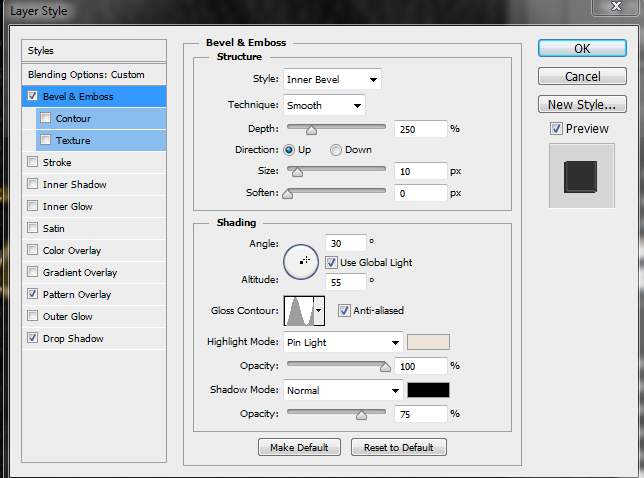
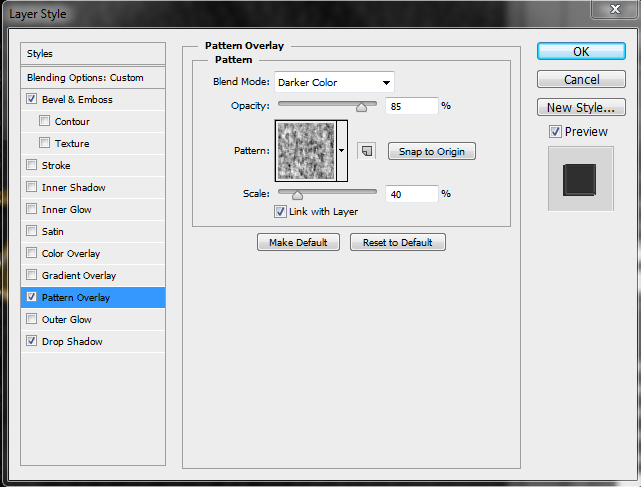
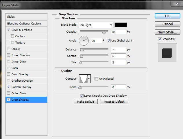
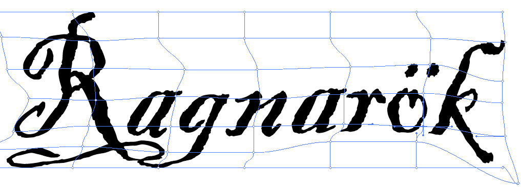
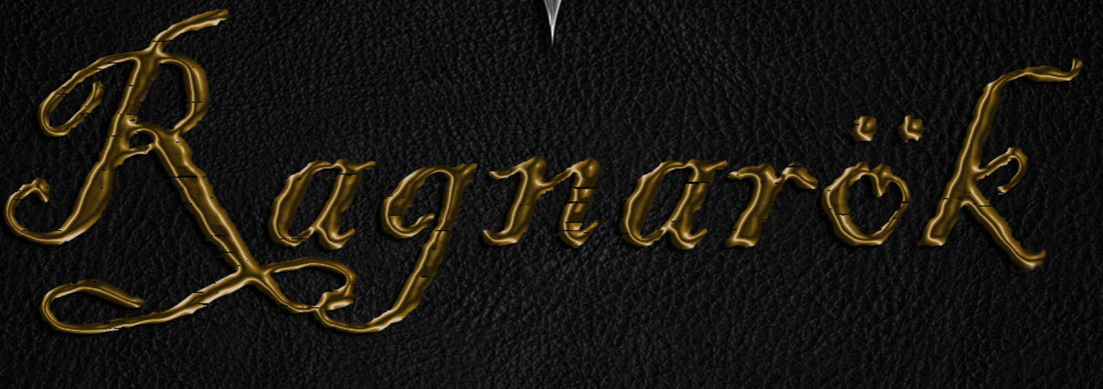
          Apart from simple placement tools, I used the text wrap tool a lot. The text around the centre of the disc was created by making a rectangle and then moving and curving the anchor points to make the text follow the curve of the draconic ring, and then by using a circle and creating a clipping mask, the text could curve around the inner circle. The text tool was used again for the text at the bottom, by using the type on a line tool, inverting which side of the line text was written on, and changing the start and end points, the text  follows the contour of the disc. Although blending modes were useful throughout the design, transparency masks helped me achieve one of the main elements of my disc label. (The scars and worn effect) Lastly, the colour picker was incredibly helpful as it allowed me to alter the CMYK values making it easier to achieve the perfect red colour. 

          I think it's important to compare my case with some that have been released commercially as it gives an idea as to the quality of the design and elements that are similar and different, for good or bad. To the sides are 4 disc that heavily inspired my work, they are all traditional western RPGs. My disc has a lot of similar elements such as copyright information in the center and around the outside, along with the format, Pegi rating, developer logo and technology icons. Regarding these kinds of icons, those that I am missing are only present on the Xbox 360 labels, being as my disc is for a PC, these aren't applicable to my label. Although all discs have a prominent title, they are all positioned in the center whilst mine is set off to the left slightly but this was due to a design choice. I have however followed suite with my game logo being set to the right against a black background. My reasoning for this was wanting to create a contrast between the left and right side of the disc. My disc echos the tattered effect used on the oblivion label but to a greater extent, the Oblivion disc demonstrates the effect I wanted to utilise but more subdued. 
         

           Despite this project being for an assessment for educational purposes, it is important to consider copyright. Apart from the draconian ring and map of Cyrodiil, the label does not contain any copyrighted material. If this disc were being produced, the ring would be drawn from scratch and not resemble the design seen on my disc and the map would be the one used in game. The use of various icons including the Pegi rating and developer icons would be agreed before the game entered development. The title and shield are products of the design brief and have been created by myself meaning that I have copyright on them already.


Saturday 29 March 2014

Dvd Disc Label - Ideas

           My initial ideas are quite similar to one another. They both have The Elder Scrolls Online draconian ring around the outer as I think it gives a ceremonial feel to the disc. The shield will be half of the shield I used on my front cover, positioned to the right of the disc, giving a noticeable contrast to the other half of the disc. The title will be prominent across the centre and will be the same as used in my Photoshop document, as it gives a good contrast to the black background of the disc but also stands out well against the shield. 
     The developer logo will be prominent at the top as is common with the discs I have looked at. Similarly to official discs is the technology logos at the bottom, alongside the Pegi rating. There will also be the typical copyright material around the outer edge of the disc as well as wrapping around between the outer edge of the disc and the inner circle. I will most likely go with the design on the left as it is more "zoomed in". The overall feel I want with this disc is that is an artifact, forgotten for ages and kept within the ancient tome cover. The shield in particular is prominent and is almost "protected" by the draconian ring. This is similar to other games of this genre that feature a main element such as a weapon, piece of armour, or a creature. Other game discs give the idea that the disc is a significant object and is battle worn and tired, the disc reflects this.

Cover - Back and Spine in Depth


         Whilst I have addressed the main focus points of my front cover in the "Elements of the front cover" blog posts, the following paragraphs provide detail regarding the back cover and spine.


      The top half of the back cover (right) took a similar design layout to Bethesda games as I felt this showcased a lot of features in an organised manner. The "Hookline" (pink box) was something I was keen to implement as it is a common aspect of video game cases. I used the same font that I used for my title, thus giving some consistency to the cover. Similarly I used a gold colour for the text continuing the theme to the back cover, but also making the text stand out against the blue and white background. Similar to other cases the hookline is worded to spark curiosity and uses a larger font to catch attention. 
     The description (green box) also follows the same format as a large proportion of video game cases. With the same same colour and a smaller font it provides a more detailed explanation of the game. I found the text used in the hookline to be hard to read when scaled down, therefore I found a more rustic but legible text. It is placed to the left as it fleshes out the cover whilst giving focus to the picture's elements on the right. 
     The features list (rust box) has a similar layout to a lot of video game cases I looked at, The screenshots are placed an even distance apart and are noticeably different. I used a simple font for the title text as it had to stand out but be easily read, this is teamed with a slightly lighter version of the hookline font colour with a tinge of orange. The feature description text differentiates itself from the other text by being in white and italics, thus drawing attention.  


     The bottom of the case contains official icons pertaining to the technology, rights and ownership of the content. The Pegi, technology and accolade icons (yellow boxes) are taken directly from the companies official website. I have placed them where they commonly are on other cases and spaced them evenly apart. The IGN E3 accolade was taken from a case that had won the award and placed in a standalone spot, as opposed to on the front cover where they usually are.
     The address, websites and barcode (blue boxes) are typical case elements, the game and company usually have separate websites that are printed on the case, I have emulated this and placed them where they are on the majority of cases. The address of the company is put above the copyright section, I have made my own fictional address for the sake of privacy so I could put it on the case. Below is a paragraph regarding copyright, this is comprised of official copyright statements that I have sourced from games featuring their technology, or their website. In keeping with the fiction I have also included my own copyright statement regarding Mixed Productions. Lastly, I obtained the barcode from a stock image site. 
     The Microsoft elements (rust boxes) were taken from a high resolution scan of a PC game after noticing that their logo was on most if not all game cases, the feature logos and warning were also taken from a Microsoft GFWL case.
     The system requirements (pink box) is a concoction of the various layouts I have seen whilst looking at game cases. I selected this one in particular as it was very simply laid out, easy to understand and provided an indication of the scalability of hardware due to the minimum and recommended system requirements. I used the gold and blue colours as they stood out well against the black background and also easily differentiated themselves apart, making it easy to determine which were minimum and recommended requirements. 

     The spine was very simple, as are most video game case spines. The PC DVD logo at the top (pink box) was cut and placed onto the cover from a high res scan of a cover. The title (orange box) is the original title, rotated and scaled down to fit, as is the developer logo (blue box).


Basics of Premiere Pro

          Below you will find a video I made detailing and demonstrating the basic features we have learnt in photoshop, including marking in and out, the pen tool, edit tools and transitions.


Youtube Video - https://www.youtube.com/watch?v=aky7Wlw5GMQ

Tuesday 18 March 2014

Evaluation of case


          With my case now finished I think it is important to look at what I have produced and give my thoughts on it, what I like and what I don't, things I'd do differently, techniques I've learnt along the way and how my work looks in comparison to blockbuster game cases.


          Overall I'd say that I'm happy with the cover, it looks very much like an official game cover and demonstrates a lot of techniques that I have taught myself. If I had to choose one element, I'd say the shield is my proudest achievement. It took a lot of work to get the shield design I wanted and a lot more work to give the metallic effect that can be seen,  combined with the effects I applied to it and the alterations to the reflection I think it looks pretty convincing.  By contrast I would (should I have the time) like to make a few more alterations to the claw marks and the burnt corner as I believe that I would be able to improve on them with some of the techniques I have learnt whilst working on other areas of the design. I don't think the claw marks demonstrate the skills I am now capable of and I think the corner stands out too much, I would like to spend some time making it appear more realistic. I would like to add a blood splatter across the shield on the front cover but that would only be if I had time to spare at the end of the project, and if I had a lot of time left I would like to explore meshes as I think they would be useful for doing 3D looking book bindings. 


          There haven't been many problems to overcome regarding the cover (apart from time management!), the only problem that I could think of would be putting effort into aspects that haven't been used in my final design such as the wax and my other attempt at a shield. However, even though these attempts haven't panned out well, my cover has benefitted from it by forcing me to explore other avenues and do more research. 


          Although I have been taught how to use the more basic functions of photoshop, a lot of the effects I wanted to use had to be learnt via online tutorials or by experimentation. The use of various tools such as the smudge, blur and burn tool were essential when designing the corner of the book, as were the multitude of effects I used for the shield including gradient, overlay, drop shadow and satin. The rendering options were detrimental to the entire case allowing for a wide variety of effects and uses that were not intentional. The flexibility of sliders in the adjustment sections allows for great precision when making alterations to opacity, flow, tolerance, brush and image sizing. One of the most helpful things I have used is folders and layer names. To begin with I used the default labels Photoshop assigned to layers but as the amount of layers began to grow it became very hard to keep track of which layer was which. By using folders it became very easy to keep my layers organised, and within those folders aptly named layers made it easier to find the one I wanted.


           I think it's important to compare my case with some that have been released commercially as it gives an idea as to the quality of the design and elements that are similar and different, for good or bad. To the sides are 4 cases that heavily inspired my work, they are all traditional western RPGs. My case has the same design elements; a central title with a main logo underneath and a tattered look.My front cover differs with my logo at the top, as well as the claw marks and tattered corner which I would class as main elements, these covers don't have any other main focus apart from the logo. 

        The only thing similar would be the metal spine clasps/spine reinforcements on the older 2 game covers. They are obviously required to have the various icons relating to age rating, platform, copyrights etc. Both mine and the examples have a description with a few screenshots but only Baldur's Gate does not have system requirements, tagline or features list. This could be due to the games age, being the oldest of the 4. 

          Despite this project being for an assessment for educational purposes, it is important to consider copyright. However, with the material I have used there aren't many issues. Everything apart from the logos and 3 screenshots are either my own work or material that is available to use for free. I have however taken copyright information from the respective company's websites and used that in my small print at the bottom of the cover. The screenshots are not my own but the author is happy for them to be used privately which this cover essentially is. If however this case was to be distributed I would have to seek permission from the various parties.

Sunday 16 March 2014

Elements of the Case - Update


          As can be seen above, my case is heading towards the final stages of development. One element that was preventing the case from looking like a finished product was the lack of logos and labels that are placed on media cases.. 

Developer Logo - The 'Mixed Productions' logo is the hand-designed icon that is used to represent my self publishing company. The design idea was a natural progression from the name, I wanted two words that had highly contrasting styles. Mixed was done using the pen tool and a grunge brush style, I drew very 'loosely' giving it a more natural look. This is contrasted by the productions which is using an ordinary, smart font with slightly smaller spaces in between the letters. 

Copyright Section - This section is made up of information I gathered from a variety of sources including games, press material and the respective company's websites. I acquired a similar size scanned image and drew a rectangle over the copyright information and used the text tool on it so text would be constrained to the size of the box. After the text had been placed, I deleted the box and set my copyright information to the same orientation as the majority of other cases I had looked at. 

Various Symbols - The PEGI symbols were taken from the official website as a way of ensuring they were legitimate. Various technology, feature, and warning logos were taken from high resolution scans of released games. The system requirements table is a combination of various layouts but the one above being the most common, showing the minimum and recommended specs gives the user an idea as to how demanding the game will be on their system. I used colours that would stand out against the background but that wouldn't be lost between other pieces of text.

Description - Like the majority of cases I have looked at, I have a 'hook line' at the top in larger writing as a way of grabbing the user's attention. This flows into a description about the story and the type of content that will be within the game. The top line has a more artistic font as it is bigger and therefore easily legible, meanwhile in the description I have selected a primitive looking font but one that is also readable at the text size required. Both share the same colour as it is similar to the colour on the front and also stands out against the white and blue background. The text beneath the 3 screenshots show the range of features the game has to offer, with title text larger and a different colour to attract the user's eye. The text beneath that is white and in italics, again differentiating itself from the other white text on the cover. The screenshots used on the back are deliberately varied and chosen for the amount of detail on show.


Elements of the Front Cover - Title

Bevel Settings
Pattern Overlay
My design for the title text had to be something in line with the name's meaning, matched my theme but also looked primitive whilst still being legible. I experimented with Old Norse runes but when I had finished the word, it didn't look like the word it was meant to represent. 


Shadow Settings

I used bevel and emboss to make the text appear as if it was melted metal and applied a colour gradient to give the impression that the metal was gold. (My reasoning is that as something important to the apocalypse, it would be treated better than other things.) Following this, I applied a drop shadow in keeping with the overall 30degree lighting effect.
Meshing around
I opened  Illustrator and browsed the fonts before choosing Blackadder ITC, however it looked too neat. Using 'make mesh'  I dragged the text to the right slightly, resulting in an untidy appearance. 

Despite the luxury that this item would have been afforded, I wanted it to look worn as if it had been around for many years. I tried using a pattern overlay but as much as I tweaked the settings or patterns, the pattern was always too prominent. Using the lasso tool, I drew around the title and pressed 'Q' to activate a quick layer mask. Pressing 'Ctrl + I' to invert, I used filter - pixelate - mezzotint - long strokes, pressed 'Q', edit - clear and finally 'Ctrl + D' to deselect. This chipped away some of the text making it appear as if it had been dragged along a rough surface. 


Before Layer Mask

Lastly, I added a layer mask and used the 'Rough Texture' brush to decrease the shine and make the metal look beaten.


Final Result

Friday 14 March 2014

Compression

          One thing that is often overlooked when dealing with images, is file size. With high capacity storage a few more megabytes of data is not a huge concern however when images are being used on a website, the size of the file will determine how long it takes for the page to load. (For example some pictures in my post will be small therefore loading almost instantly, whilst screenshots from games will more than likely take a while due to the fact they are high resolution)
Low
         JPEG is a lossy format, meaning that when the image is compressed the least important pixels out of an 8x8 selection are discarded. Using the highest quality compression technique a 92,000kb file can be compressed to 30,000kb, reducing the transfer rate from 20 seconds to 6 seconds. This can further reduced to 9,000kb and 2 seconds and 5,000 and 1 second, for medium and low quality compression respectively. There is a notable difference between low and medium, but not so much between medium and high despite the decrease in transfer speed. 
Medium
High
 I will also have to pay close attention to compression when dealing with video as I will be filming in 1080p which will result in large file sizes.


          During lesson time, we conducted a range of tests regarding file sizes and compression. The following tables show the file sizes for a large picture and an icon size image. It is up to the individual as to whether they think the picture quality is satisfactory or not, therefore I have uploaded all images tested below allowing people to see which type of compression best suits their needs. Compression Folder


Large Picture Table
Icon Table


Compression folder - https://www.dropbox.com/sh/pfmrbcl1lf6txsp/5KHAiTJzB_
Information - http://www.learningspark.com.au/kevin/issues/jpeg_compression.htm

Thursday 13 March 2014

Elements of the Front Cover - Logo Update

          After using a lot of techniques on my previous shield attempt, it didn't match my idea for the logo. I thought about the type of material it would have been made from, highly shined metal, and thought of real world metals that would be a good match. I researched chrome textures and found a tutorial on how to create one. I followed the tutorial to the letter utilising techniques such as bevel and emboss, contour, satin, gradient overlay and stroke with a convincing looking final image. However, it didn't fully meet my demands so I loaded up skyrim and took a few screenshots in bars with thought to the perspective of the book and the reflection that would be seen on the book. 


After choosing the picture I felt best encapsulated the mood, I used curve to brighten the image as it looked too dark. Then using filter - distort - wave, I tweaked the image resulting in it looking like it was being reflected off of a metal surface. Then edit - transform - perspective, shifted the image inwards 30 degrees giving the impression the objects are higher than they actually were. Finally I flipped it vertical as all of my shadows are/will be at a 30 degree angle, and this gave the lends to the idea that the shadows are being cast by the reflected candle. 

 I changed the tutorial's gradient to something more in line with my cover's overall design. I changed the gradient to warmer colours and set it to overlay at 30 degrees. This gave my shield a warm outline like that which would actually be cast. Lastly, I used filter - render - clouds, filter - sketch - chrome and select - modify - contract and set the layer to 80% opacity allowing the candles shine to be more evident. After merging all layers and duplicating the final image into my cover, I applied a drop shadow with a  soft light blending mode giving the logo more depth.

    Reflection final result:                                                     Shield Final Result


Chrome tutorial - http://www.mahalo.com/how-to-make-chrome-in-photoshop/

Sunday 9 March 2014

Elements of the Case

          I am in a position where I know what design elements I want on my front cover but apart from the basics, such as name and certificate, I was unsure as to what case elements I needed to make space for, such as developer logo and platform. I analysed 14 WRPG PC game cases and made notes on what elements were present on the case and also what were the most common elements across all of the game cases. This is important to me as I want to design a very convincing and realistic cover.

The games I looked at were:


Baldur's Gate

Dark Souls
Demonicon
Divine Divinity
Divinity 2
Dragon Age: Origins
Game of Thrones
Oblivion
Risen (German Version)
Risen 2
Risen 2 (Czech Republic/Hungary Version)
Skyrim
The Witcher 2
Two Worlds II

The table below shows what elements were on the some of the cases with those larger and in blod being the elements that were seen across the majority. With this knowledge I can now begin a draft of overlays for the back, spine and front covers.


Back
Description
Spine
Description
Front
Description
Hook line
A subtitle/ subheading that get’s consumer attention
GFWL Logo
If shown, uses the GFWL online service
GFWL Logo
If shown, uses the GFWL online service
Write-up
A description of the game setting/ story
Name
The Name of the product
Name
The Name of the product
Features
A list of elements the game has that are interesting/ unique
PAL Logo
If shown, locked to PAL region
PAL Logo
If shown, locked to PAL region
Website
Website of the game
PC-DVD Logo
Details what platform the game is for
PC-DVD Logo
Details what platform the game is for
Publisher Logo
The logo of the company that published the game
Publisher Logo
The logo of the company that published the game
Publisher Logo
The logo of the company that published the game
Developer Logo
The logo of the company that developed the game
Developer Logo
The logo of the company that developed the game
Developer Logo
The logo of the company that developed the game
PEGI Rating + Website
The PEGI rating, individual elements and PEGI website
Certificate
What certification the game received
Certificate/PEGI Rating
What certification/ PEGI rating the game received
Barcode
Game’s barcode
Game Logo
The logo of the game
Game Logo
The logo of the game
Dolby Symbol
If shown, supports Dolby Surround


Accolades
Accolades awarded to the game
Family Settings
If shown, supports family settings


Critic Quotes
Quotes from press reviewers
Warning
Advises the user to read the game guide before playing


Screenshots
In game screenshots


PC-DVD Logo
Details what platform the game is for


System Requirements
Minimum/ recommended pc specs


Certificate
Certification the game received


Tech Symbols
Symbols detailing the technology used within the game


Address
Address of publisher


Accolades
Accolades awarding to the game


Internet Requirement
If shown, game requires  an internet connection for some features or registration 


Controller Support
If shown, the game supports various gamepads


Trademarks
This small print details the copyright and trademark rights of all parties involved  


Baldur's Gate - http://tinyurl.com/p8maglm
Dark Souls - http://tinyurl.com/qgsabp8
Demonicon -http://tinyurl.com/qducn2z
Divine Divinity -http://tinyurl.com/pcubjo3
Divinity II - http://tinyurl.com/p65hnyf
Game of Thrones - http://tinyurl.com/oe87wu9
Oblivion - http://tinyurl.com/onzvxyr
Risen (German Version) - http://tinyurl.com/p77f7q5
Risen 2 (English Version) - http://tinyurl.com/pajsmkw
Risen 2 (Czech Republic/Hungary Version) - http://tinyurl.com/qeq3wmy
Skyrim - http://tinyurl.com/orukfx8
The Witcher 2 - http://tinyurl.com/nd5wvc8
Two Worlds II - http://tinyurl.com/ptw4glt