Elements of the Front Cover - Title
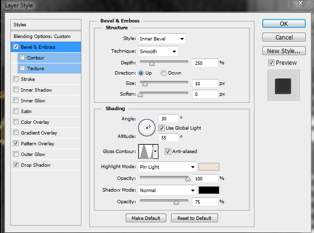 |
| Bevel Settings |
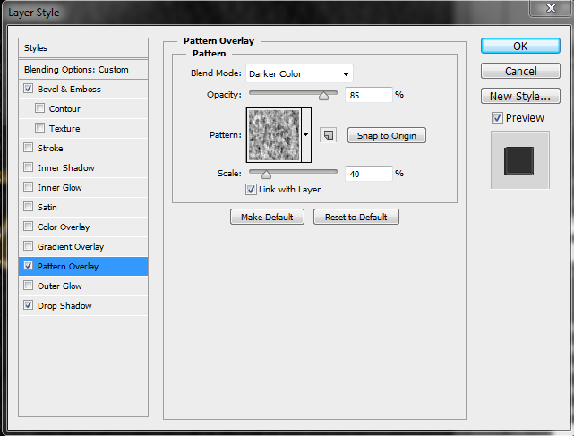 |
| Pattern Overlay |
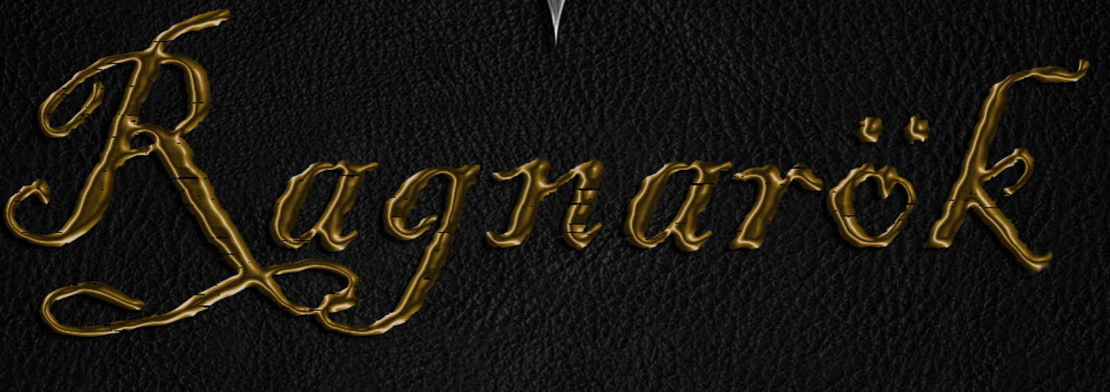
My design for the title text had to be something in line with the name's meaning, matched my theme but also looked primitive whilst still being legible. I experimented with Old Norse runes but when I had finished the word, it didn't look like the word it was meant to represent.
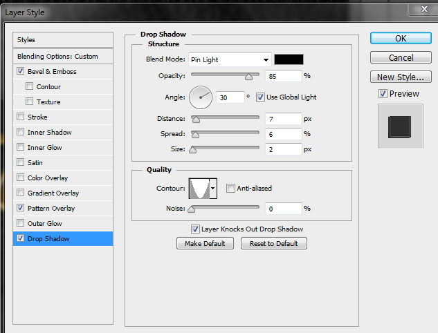 |
| Shadow Settings |
I used bevel and emboss to make the text appear as if it was melted metal and applied a colour gradient to give the impression that the metal was gold. (My reasoning is that as something important to the apocalypse, it would be treated better than other things.) Following this, I applied a drop shadow in keeping with the overall 30degree lighting effect.
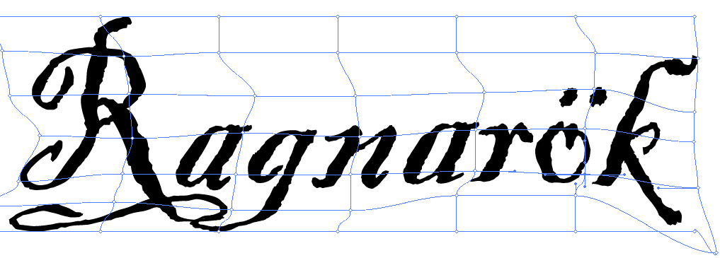 |
| Meshing around |
I opened Illustrator and browsed the fonts before choosing Blackadder ITC, however it looked too neat. Using 'make mesh' I dragged the text to the right slightly, resulting in an untidy appearance.
Despite the luxury that this item would have been afforded, I wanted it to look worn as if it had been around for many years. I tried using a pattern overlay but as much as I tweaked the settings or patterns, the pattern was always too prominent. Using the lasso tool, I drew around the title and pressed 'Q' to activate a quick layer mask. Pressing 'Ctrl + I' to invert, I used filter - pixelate - mezzotint - long strokes, pressed 'Q', edit - clear and finally 'Ctrl + D' to deselect. This chipped away some of the text making it appear as if it had been dragged along a rough surface.
 |
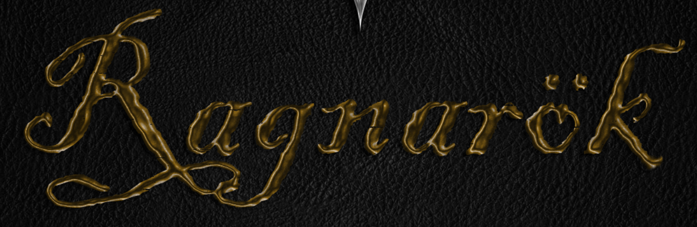
Before Layer Mask
|
Lastly, I added a layer mask and used the 'Rough Texture' brush to decrease the shine and make the metal look beaten.
 |
| Final Result |
No comments:
Post a Comment