Sunday, 16 March 2014

Elements of the Front Cover - Title

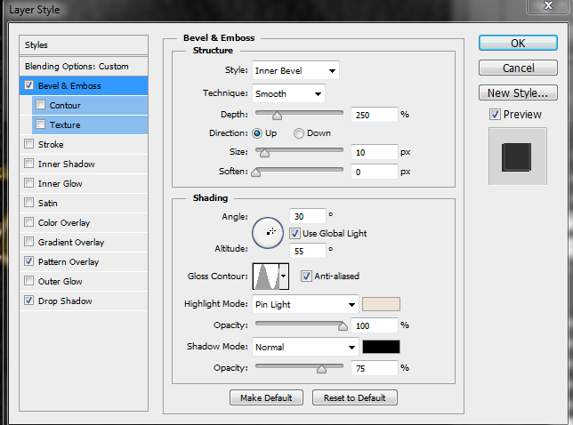
Bevel Settings
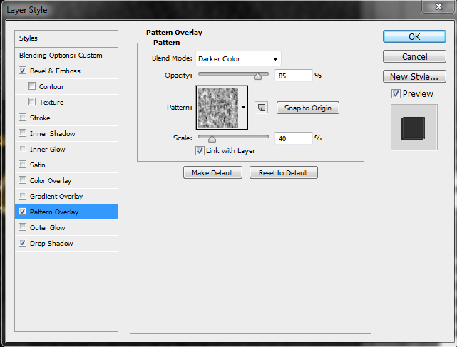
Pattern Overlay
My design for the title text had to be something in line with the name's meaning, matched my theme but also looked primitive whilst still being legible. I experimented with Old Norse runes but when I had finished the word, it didn't look like the word it was meant to represent. 


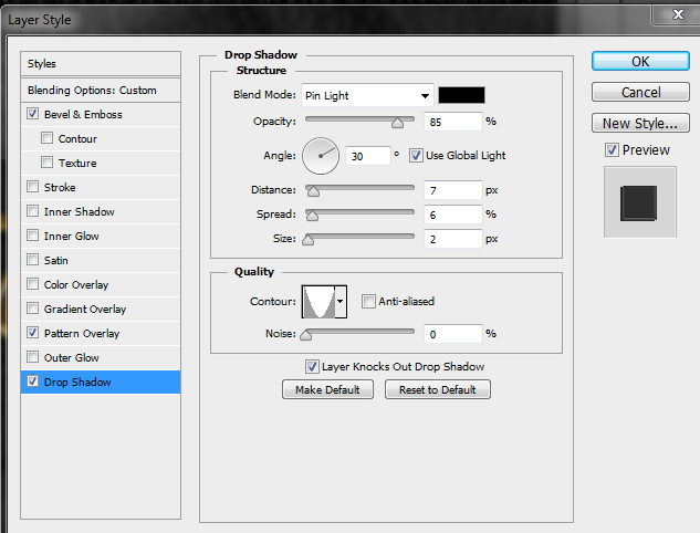
Shadow Settings

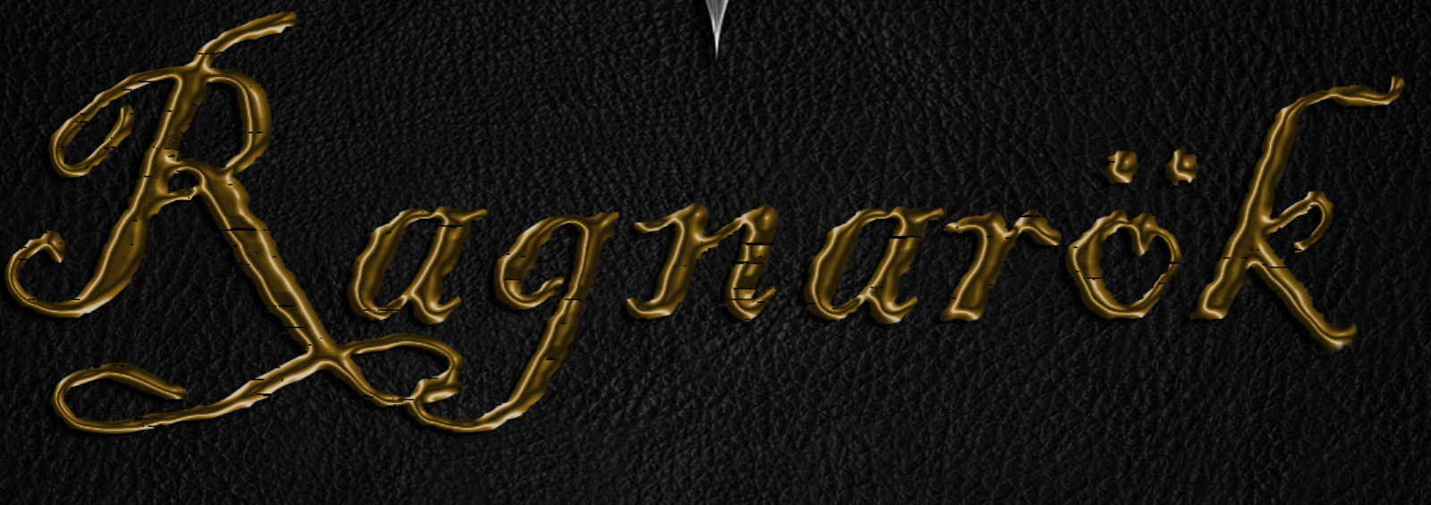
I used bevel and emboss to make the text appear as if it was melted metal and applied a colour gradient to give the impression that the metal was gold. (My reasoning is that as something important to the apocalypse, it would be treated better than other things.) Following this, I applied a drop shadow in keeping with the overall 30degree lighting effect.
Meshing around
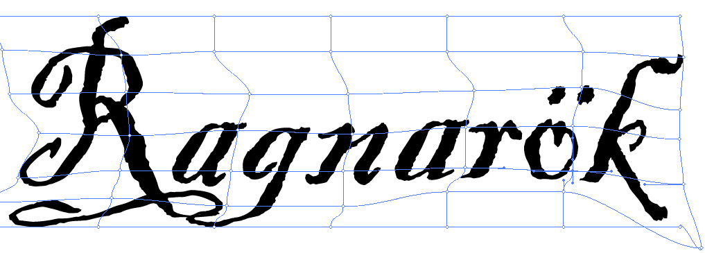
I opened  Illustrator and browsed the fonts before choosing Blackadder ITC, however it looked too neat. Using 'make mesh'  I dragged the text to the right slightly, resulting in an untidy appearance. 

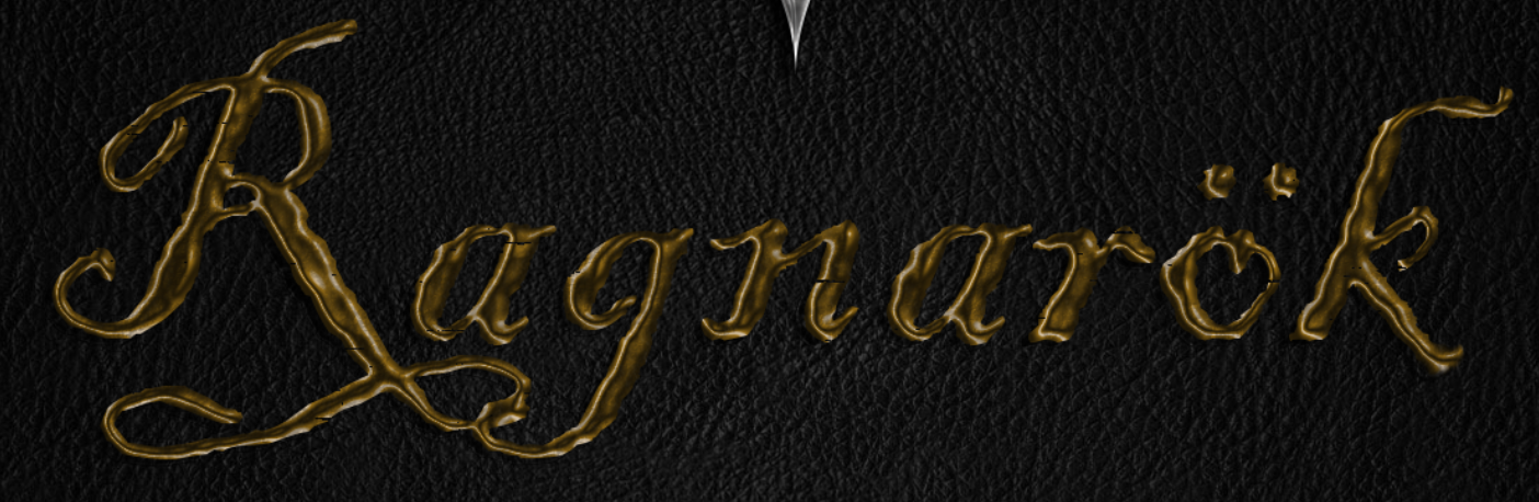
Despite the luxury that this item would have been afforded, I wanted it to look worn as if it had been around for many years. I tried using a pattern overlay but as much as I tweaked the settings or patterns, the pattern was always too prominent. Using the lasso tool, I drew around the title and pressed 'Q' to activate a quick layer mask. Pressing 'Ctrl + I' to invert, I used filter - pixelate - mezzotint - long strokes, pressed 'Q', edit - clear and finally 'Ctrl + D' to deselect. This chipped away some of the text making it appear as if it had been dragged along a rough surface. 


Before Layer Mask

Lastly, I added a layer mask and used the 'Rough Texture' brush to decrease the shine and make the metal look beaten.


Final Result

Friday, 14 March 2014

Compression

          One thing that is often overlooked when dealing with images, is file size. With high capacity storage a few more megabytes of data is not a huge concern however when images are being used on a website, the size of the file will determine how long it takes for the page to load. (For example some pictures in my post will be small therefore loading almost instantly, whilst screenshots from games will more than likely take a while due to the fact they are high resolution)
Low
         JPEG is a lossy format, meaning that when the image is compressed the least important pixels out of an 8x8 selection are discarded. Using the highest quality compression technique a 92,000kb file can be compressed to 30,000kb, reducing the transfer rate from 20 seconds to 6 seconds. This can further reduced to 9,000kb and 2 seconds and 5,000 and 1 second, for medium and low quality compression respectively. There is a notable difference between low and medium, but not so much between medium and high despite the decrease in transfer speed. 
Medium
High
 I will also have to pay close attention to compression when dealing with video as I will be filming in 1080p which will result in large file sizes.


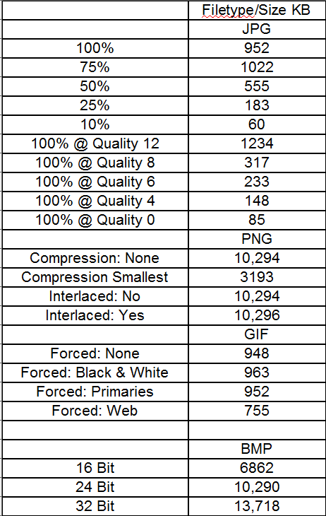
          During lesson time, we conducted a range of tests regarding file sizes and compression. The following tables show the file sizes for a large picture and an icon size image. It is up to the individual as to whether they think the picture quality is satisfactory or not, therefore I have uploaded all images tested below allowing people to see which type of compression best suits their needs. Compression Folder


Large Picture Table
Icon Table


Compression folder - https://www.dropbox.com/sh/pfmrbcl1lf6txsp/5KHAiTJzB_
Information - http://www.learningspark.com.au/kevin/issues/jpeg_compression.htm

Thursday, 13 March 2014

Elements of the Front Cover - Logo Update

          After using a lot of techniques on my previous shield attempt, it didn't match my idea for the logo. I thought about the type of material it would have been made from, highly shined metal, and thought of real world metals that would be a good match. I researched chrome textures and found a tutorial on how to create one. I followed the tutorial to the letter utilising techniques such as bevel and emboss, contour, satin, gradient overlay and stroke with a convincing looking final image. However, it didn't fully meet my demands so I loaded up skyrim and took a few screenshots in bars with thought to the perspective of the book and the reflection that would be seen on the book. 


After choosing the picture I felt best encapsulated the mood, I used curve to brighten the image as it looked too dark. Then using filter - distort - wave, I tweaked the image resulting in it looking like it was being reflected off of a metal surface. Then edit - transform - perspective, shifted the image inwards 30 degrees giving the impression the objects are higher than they actually were. Finally I flipped it vertical as all of my shadows are/will be at a 30 degree angle, and this gave the lends to the idea that the shadows are being cast by the reflected candle. 

 I changed the tutorial's gradient to something more in line with my cover's overall design. I changed the gradient to warmer colours and set it to overlay at 30 degrees. This gave my shield a warm outline like that which would actually be cast. Lastly, I used filter - render - clouds, filter - sketch - chrome and select - modify - contract and set the layer to 80% opacity allowing the candles shine to be more evident. After merging all layers and duplicating the final image into my cover, I applied a drop shadow with a  soft light blending mode giving the logo more depth.

    Reflection final result:                                                     Shield Final Result


Chrome tutorial - http://www.mahalo.com/how-to-make-chrome-in-photoshop/

Sunday, 9 March 2014

Elements of the Case

          I am in a position where I know what design elements I want on my front cover but apart from the basics, such as name and certificate, I was unsure as to what case elements I needed to make space for, such as developer logo and platform. I analysed 14 WRPG PC game cases and made notes on what elements were present on the case and also what were the most common elements across all of the game cases. This is important to me as I want to design a very convincing and realistic cover.

The games I looked at were:


Baldur's Gate

Dark Souls
Demonicon
Divine Divinity
Divinity 2
Dragon Age: Origins
Game of Thrones
Oblivion
Risen (German Version)
Risen 2
Risen 2 (Czech Republic/Hungary Version)
Skyrim
The Witcher 2
Two Worlds II

The table below shows what elements were on the some of the cases with those larger and in blod being the elements that were seen across the majority. With this knowledge I can now begin a draft of overlays for the back, spine and front covers.


Back
Description
Spine
Description
Front
Description
Hook line
A subtitle/ subheading that get’s consumer attention
GFWL Logo
If shown, uses the GFWL online service
GFWL Logo
If shown, uses the GFWL online service
Write-up
A description of the game setting/ story
Name
The Name of the product
Name
The Name of the product
Features
A list of elements the game has that are interesting/ unique
PAL Logo
If shown, locked to PAL region
PAL Logo
If shown, locked to PAL region
Website
Website of the game
PC-DVD Logo
Details what platform the game is for
PC-DVD Logo
Details what platform the game is for
Publisher Logo
The logo of the company that published the game
Publisher Logo
The logo of the company that published the game
Publisher Logo
The logo of the company that published the game
Developer Logo
The logo of the company that developed the game
Developer Logo
The logo of the company that developed the game
Developer Logo
The logo of the company that developed the game
PEGI Rating + Website
The PEGI rating, individual elements and PEGI website
Certificate
What certification the game received
Certificate/PEGI Rating
What certification/ PEGI rating the game received
Barcode
Game’s barcode
Game Logo
The logo of the game
Game Logo
The logo of the game
Dolby Symbol
If shown, supports Dolby Surround


Accolades
Accolades awarded to the game
Family Settings
If shown, supports family settings


Critic Quotes
Quotes from press reviewers
Warning
Advises the user to read the game guide before playing


Screenshots
In game screenshots


PC-DVD Logo
Details what platform the game is for


System Requirements
Minimum/ recommended pc specs


Certificate
Certification the game received


Tech Symbols
Symbols detailing the technology used within the game


Address
Address of publisher


Accolades
Accolades awarding to the game


Internet Requirement
If shown, game requires  an internet connection for some features or registration 


Controller Support
If shown, the game supports various gamepads


Trademarks
This small print details the copyright and trademark rights of all parties involved  


Baldur's Gate - http://tinyurl.com/p8maglm
Dark Souls - http://tinyurl.com/qgsabp8
Demonicon -http://tinyurl.com/qducn2z
Divine Divinity -http://tinyurl.com/pcubjo3
Divinity II - http://tinyurl.com/p65hnyf
Game of Thrones - http://tinyurl.com/oe87wu9
Oblivion - http://tinyurl.com/onzvxyr
Risen (German Version) - http://tinyurl.com/p77f7q5
Risen 2 (English Version) - http://tinyurl.com/pajsmkw
Risen 2 (Czech Republic/Hungary Version) - http://tinyurl.com/qeq3wmy
Skyrim - http://tinyurl.com/orukfx8
The Witcher 2 - http://tinyurl.com/nd5wvc8
Two Worlds II - http://tinyurl.com/ptw4glt