Sunday 11 May 2014

Evaluation of Trailer


With my trailer finished, it is important to look back over this section of the project and reflect on what I am proud of, what I would like to change and how it compares to real world examples.

I set out to create a trailer that gave the viewer a clear impression of what the game was comprised of, and flowed smoothly. I feel I have achieved this thanks to the footage I filmed myself, the transitions and techniques I used and the dramatic soundtrack. I am pleased I got the opportunity to learn about and use green screen as it is a very important tool used in industry, after tweaking various settings such as choke, highlight and pedestal etc. I feel very confident in my ability to eradicate the green background without affecting the picture and I believe this is evident within my trailer.
Another section I am pleased with is the transitions between the 4 water scenes, I feel I successfully picked the most suitable transitions that allowed them to seamlessly flow into one another. Lastly I am very pleased that all the footage tied in with the music and that this was evident to viewers. I spent a great deal of time ensuring the clips encapsulated the mood of my game but also fit in with the changing tones of the music. From viewer feedback, this came across clearly and special additions such as an action scene at the crescendo and the bass thud as the black screen appears, were noticed and appreciated.

 Although I am happy with my video, it is important to look back on sections I am not happy with and, given another attempt, would like to improve. I originally wanted a different piece of music at the beginning that was more foreboding that the piece I have currently, I tried using the razor tool and a combination of different audio effects/transitions to make the change seamless but everything was too obvious, if I had more time/another chance I would like to find a piece of abridging music that would allow the two, to fade into one another.
Another thing I would change would be the real life filming location. I would like to have found a very dense forest for filming as I believe it would have the made the transition between game and live action a little more convincing. I would also like to improve upon the filming itself, due to the uneven ground it was very hard to keep the camera steady and even when moving slowly, the footage was shaky. I tried using the stabilise video effect on the clip but this meant I couldn't add any other effects. I instead opted to use a camera blur and alter the brightness and contrast to give the impression of running in first person.
I additionally wanted a voice over to say typical epic/fantasy phrases as a way of giving the viewer extra information or background to the trailer but never got chance to make any sound recordings. I also wanted to add titles for the same reason but due to the time restriction of the trailer I never got chance to add them as it would have extended my trailer beyond the 1 minute cut off point.
Although it is necessary for submission, I would have liked to be able to render my video with different settings, namely a higher resolution and framerate than 720x576 and 25fps respectively. My footage was filmed at 1920x1080 and 60fps and I feel my trailer would have benefited from being shown at this resolution and framerate.

There haven't been many problems during development worth mentioning, the main problem though has been the time constraint of the trailer. One clip of my own footage was averaging 3 minutes so choosing what footage to keep and what to bin became a problem. There was a fine balance between making the trailer look good but also being able to demonstrate my ability to satisfy the mark scheme, although I believe I have accomplished this. Having to speed clips up quickly made good material very distracting as I wanted to fit so much in, videos soon became flipbooks. In the end, by tweaking speeds and keep only necessary footage I have a trailer that I believe is in entertaining but also demonstrates my abilities.

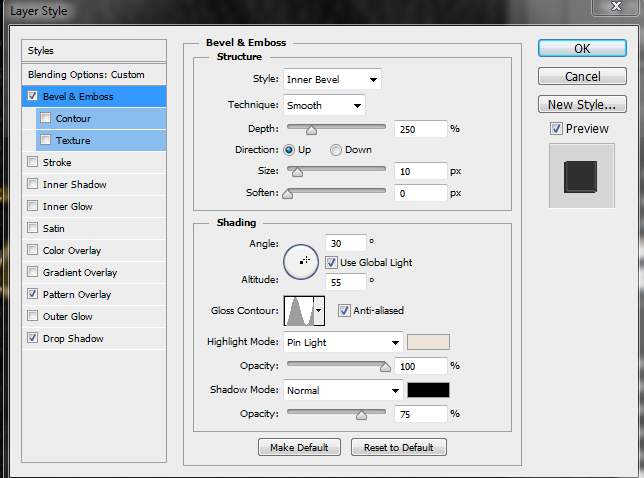
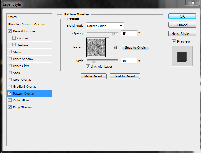
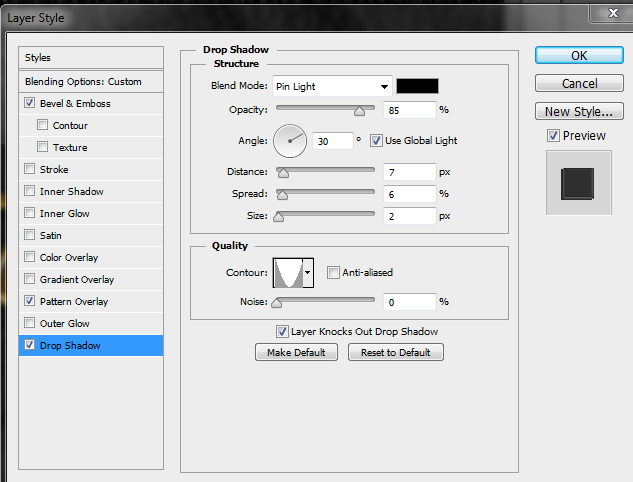
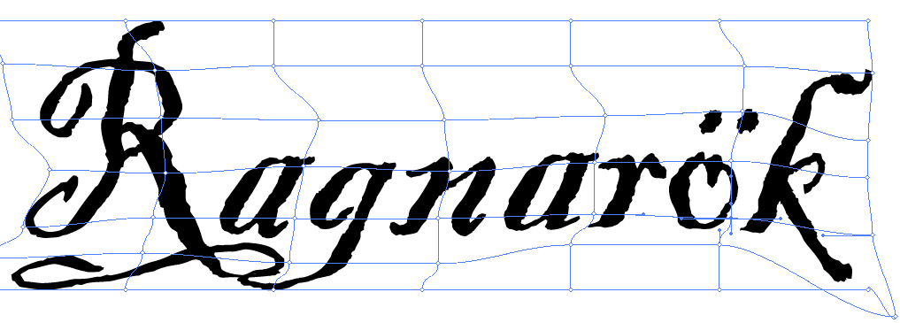
Being as we were only taught the basics of premiere, I experimented with various techniques and effects and ended up with the video seen above. Specifically I spent a lot of time altering the effects within the title workspace, such as sheen and texture among others seen in my 'Trailer Last 22 Seconds" blog post. The use of green screen also allowed me to experiment with the settings and demonstrate my ability through the use of colour correction and matte cleanup and generation. The majority of transitions and the changes made to them have been self taught.

I believe it is important to compare and contrast work to real trailers released for a product, this gives me something to weigh my trailer against but can also provide avenues to explore should I change/improve my trailer.

My trailer is quite similar to the Skyrim trailer, they both have the character running through a forest before being confronted with a dragon, various environments being showcased, and clips matching the music. The environmental shots have the same type of dissolve transitions that mine has, however I chose clips that would fade together well, whilst this trailer has different environments fading into one another. I also believe that my trailer gets across the tone for the game in the same way that this trailer does. In this trailer there are scenes of real time combat that I would have liked to emulate in my trailer, however I did not have the same tools at my disposal that the developers have.


Similar to the Bound by Flame trailer, my soundtrack starts subdued without much action on-screen before increasing in intensity with more action and eye-catching footage. Similar to the Skyrim trailer, I would have liked to have real time battle footage but I did not have the resources available.(Although the battle in the trailer looks choreographed.) There don't appear to be any transitions between various clips and scenes which I personally would have added to make the trailer flow better, as I feel mine has benefited from them                                                                                                                                                                                                                                                                                               


Similar to my project, the Oblivion trailer has a lot of environment scenes that are connected by dissolve transitions. The battle scenes are placed at the end, as it goes from light to dark scenes over the course of  the trailer which is a contrast to mine which progress from dark to light. The use of titles and voiceovers give the viewer extra knowledge about the story, this is something I would have liked to include in my trailer. 


It is important to look at the source material and be aware of copyright issues that would arise if released. The game footage in my video was filmed within Skyrim which is property of Bethesda so releasing this publicly would be a breach of copyright. However, if this were a real project, the gameplay footage would be sourced from the game itself which would be property of the developer. The footage at end was filmed by me and is there for my property to use as I please, therefore there would be no infringement caused by those scenes. 

Saturday 10 May 2014

Peer Feedback on Trailer

         Being as I have finished my trailer I thought it would be beneficial for me to gather some feedback from my peers, this could be used to make changes to to the trailer, give me ideas for the future and also give me a better understanding of what viewers think of my video. 

User F

Even though I am not usually an individual who would play such a videogame, this particular trailer is one that definitely draws you in. Personally I think my favourite part is the choice of the backing music which works perfectly with the theme of the game, and has a great feel to how the trailer progresses. The crescendo of the music peaks at just the right point with the battling and fighting beforehand, and then the peak hits with the mythical dragon. The use of green screening was very innovative which links into footage from the game really well. All in all a trailer that gives a great insight to the game, clips that work together and flow well, and certainly makes you want to see more.


My Response - As discussed in one of my previousblog posts, the choice of music was very important to achieve the results discussed here, particularly the crescendo at the dragon clip. I'm pleased this has resonated with the viewer. One of the main objectives I set for my video was that it flows, I am pleased that the viewer thought it did.

User S

This is a well made and eventful trailer, showing the best of the world it is set in, both dark and good. There are also many commendable parts to the trailer that really draw the viewer in, but what ties it all together is the epic and heroic music that dwells behind the action and beautiful naturalistic scenes. The music brings the story to life as the character battles his way through the world, really engaging the viewer and making it seem that they are the character themselves. This is one of those rare sound tracks which is uplifting and almost gives the viewer a sense of duty to play the game. Moving on from this, another stand out feature is the use of the green screen. The video footage seamlessly blends from game play to real life as our hero runs through the forest only to encounter a dragon. At which point, an incredible amount of skill and thought has gone into creating a dust cloud that ripples away from the dragon and blends the scene together. Finally, there are four seconds which stand out in particular to me and this is at 16 seconds - 20 seconds on which the video moves from right to left, traveling through a wall to reveal a skeleton on the other side. This is a fantastic peace of camera trickery which also beautifully encapsulates how transitions should be used. Moreover, this also demonstrates a key knowledge in the subject area as this is also common place with the genre of game and or movie. All in all, it is a fantastically made trailer which shows of the beautiful graphics of the game, but also draws the viewer in making them believe that it could be real life and actually them within this epic magical tale. I eagerly wait for the release date.


My Response - I am glad the contrast between the light and dark clips was evident, and that the music fit with the scenes on screen. I'm pleased my work on the green screen scenes was well received as I spent a lot of time altering the settings so the green wasn't visible but also didn't cut into the image. I am personally very happy with the 4 seconds the viewer is referencing, it took a lot of altering to make the transition seamless and I'm glad that the effect of the camera moving into the shadows was noticed.

Trailer - Music and Mood


The music in my trailer is something I spent a lot of time choosing, I originally wanted to splice 2 tracks together but despite experimenting with various audio transitions, the change was too obvious and really distracted the viewer from the trailer. Finally, I chose 'Heart of Courage' by composer Thomas J. Bergersen as it provided a subdued start before reaching a crescendo before trailing off at the end. Very little was done to the track apart from cutting the section I needed, increasing the base and altering the volume. At 00:14:04 the character attacks a bandit as drum hit in the soundtrack, I increased the bass at this point as a way of emphasizing the impact of the sword. As the title, date and developer logo fade out at the end of the trailer, the soundtrack gradually fades out due to the use of pen anchor points placed at 100% and 0%.

A knife 'stabbing' sound is also played at each clip played during the war trail scene. I felt that without these sounds these small clips seemed to carry no effect. For each of the clips I reduced the volume by 12.7db as any more and it was not audible and any louder and it took precedence over the soundtrack, I also increased the bass by 24 db on each clip to create a deeper 'thud' alongside the shrill knife sound. Lastly I slowed the clips down so they match the action on screen, this also increased the bass sound thus giving the actions on screen more impact.

The music was the first thing I decided on as it gave me a guide as to where I should place clips. Until 00:21:19 the music is very subdued, whilst onwards from this point the intensity increases and sounds epic until 00:52:17 where the intensity dials down into a single thud before slowly fading out. I saw these as marker points with the beginning being where I could place darker clips with scenes of evil and death, then at the crescendo having all clips being of glorious landscapes, particularly calming water. These scenes would continue until the thud at the end, and while the music fades out I could display my title, date and developer logo. I believe I stuck to these guidelines very well.


Trailer - The Last 22 Seconds

         
          After the dip to white transition (00:39:13) the next clip is of my character running through the a forest, with a sword in a first person perspective. I filmed this clip after capturing some footage of a real forest, because of this I knew to look for a similar type of woodland in game. I think I found a similar piece but definitely not identical, this is something I would like to change by either finding a different place within skyrim, or a different forest for live action footage. Due to the difference in forests, a dissolve effect didn't have the desired effect, it was too obvious and very distracting meaning the viewer focussed more on the differences rather than enjoying the trailer. Aside from the type of trees, one of the main differentiating factors was the colour scheme. To combat this I changed the brightness and contrast of the clip to 51.8 and 61.4 respectively but this still didn't provide a smooth transition.

         At 00:39:13 the clip starts to fade into black and white, this was achieved by slicing the end of the Skyrim clip and the start of the live action clip with the razor tool, applying the black and white video effect to both of them, then used the cross dissolve transition between the 4 clips to fade from Skyrim colour, black and white, then to live action black and white and finally to colour. As I also had clips in tracks 4 and 5 that started midway through the transition, I had to clip them, apply black and white, then a cross dissolve so all clips were consistent.


          Once the black and white fades into the colour (00:42:21) there are 3 clips running in parallel. The forest clip speed was increased to 257% as it was quite a long clip and needed to fit between my other clips, the speed starts to get reduced at 00:45:05, where it falls from 100% to, eventually, 1% by the end of the clip, this is to simulate the slow down at the end of sprinting. To reinforce the idea the person is running I applied a camera blur of 3% at the start of the clip which begins to reduce at 00:46:13, (when the running slow down begins to become apparent) it reaches 0% a few milliseconds later to simulate focussing on the trees.

         In track 4 I have the green screen footage of me 'running' with the sword. This effect was achieved by standing in front of the screen, holding the camera at my chest and lifting the sword up and forward, then down and back. Once the footage was completed, I applied an ultra key video effect and tweaked the settings so that the green was eradicated, but did not erase any of the sword detail.
Due to the sword's reflective surface, some of the green screen can be seen on the sword itself. To combat this I used the change colour video effect, and after keying out the green screen, used this to dull the sword colour slightly and spread the silver effect. I then copied this clip into the one above and changed the blend mode of the one below to lighten. Upon close inspection the forest can be seen through the sword, in motion this merely looks like a reflection, although I would like to tweak this more if I have time. To finish, the sword clip speed was set to -128% to match the running speed of the forest clip.

           At 00:47:24 the dragon can be seen swooping down, after being sped up. On the track above is a clip of the sword being held and swaying slightly, this was created by using a section of the original sword clip just before I started moving it, this section was then slowed down to simulate it being held still. The track below is a still from the forest clip, this was used as the person isn't moving. The dragon was downloaded from youtube, I then applied an ultra key and tweaked the settings so the green couldn't be seen but also didn't cut off any part of the dragon. I also applied basic 3D to change the angle of the dragon by 3 degrees as I felt it wasn't looking at the center of the screen.

As the dragon lands (00:49:13) I used a dust green screen effect. This was taken from youtube and an ultra key applied to it. Aside from the usual changes to make the green not visible but not cut into the dust, I also changed the luminance in the colour correction segment. By changing it to 75 the original white colour was changed to a shade of brown that matched the dirt on the floor in my forest clip, this adds to the idea that the dragon is swooping down with tremendous force. To add to this, I sped up the beginning of the clip so the dust flies up quickly, then using time remapping, slowed it down to 35% of the original speed so the dust slowly falls as there are no other forces in the scene such as wind. At 00:49:23 as the dragon rears it's head, the speed is reduced by 50% to give the impression it takes a lot of effort and power to shoot it's fire breath. At this time, the idle sword clip is changed to the sword being sheathed. This was originally at the start of the clip when it was being raised, by right clicking the clip, selecting speed/duration and clicking reverse speed, the clip played in reverse giving the impression that it is being sheathed.

At 00:52:17 the screen suddenly goes black, I did not use fade to black as I wanted the effect to be sudden after the fire had reached the screen. The clip following it had the opacity set to zero for 1 second as this fit in with the music trailing off (I will expand on this in another blog post) before slowly increasing the opacity to reveal the flames, this gives the impression they are the dragon's flame remnants. The title begins to fade in at 00:53:20, this is a screenshot of the title from the cover. Using the colour replacement tool in photoshop I changed the black background to green, then imported it into premiere, this allowed the ultra key to be easily applied eradicating the background. This technique was also applied to the developer logo seen at 00:56:22. 

The date begins to fade in at 00:55:22, this was created using the title tool. I used the center tools in the bottom left to ensure the title was central. I selected a font that matched my overall theme and found one similar to the font I used for my description on my game cover. I initially wanted the colour to be similar to that of the title so it was consistent but as I began experimenting, this changed. I positioned the fiery background behind the title, and wanted my date to reflect that there was fire present. By using the colour seen in the screenshot with the gradient, it gave the impression the fire was being reflected from the date. To aid this effect, I used a red sheen to intensify the flame colour, the angle match where the title was placed and the offset so the flame reflection was at the bottom of the letters as it would be. Finally I used the texture tool to make the date look like it was made of slightly reflective stone, this fits in with the rugged theme of my project.

The title, date and developer logo fade in one after the other so the user has time to focus and acknowledge each one, before they all begin to fade out at 00:59:05 along with the music so the trailer finishes with a black screen. I felt ending with a black screen was important as the majority of trailers I saw finished with the date and title before fading to black. 

Friday 9 May 2014

Trailer - The Middle 18 Seconds

         
        Following the shackled skeleton clip, it cuts to a dragon in an open plain firing an ice ball. (00:20:03) I wanted the blue ice ball to be available for a transition to the next clip with blue water but the ball was fired to quickly and was essentially a blue flash on screen. By using the time remapping tool I was able to slow down the clip where the dragon spits the ice ball down to 50% giving the ice ball a couple more seconds on screen giving the viewer more time to take it in. This then cuts to the clip of water rushing forward to reveal the blue sky, I didn't have a transition between these 2 clips as they felt too forced, however I feel that because the majority of the 2 clips are a similar shade of blue, it is still a move transition.

           At 00:21:19 this clip begins the transition into the clip under the bridge. I used the cross dissolve transition as I was going from a predominantly blue scene to a scene of the same type. The transition is slightly off center, beginning later in the first clip as this allowed the clip to flow better. The grey foam blended into the grey stone floor, the stone sconces blended into the bridge arches, the water and sky blending into one another make the transition flow smoothly.

         Again, going from a scene with water and blue sky to a scene in the same vane, additive dissolve enabled this change to happen without being distracting. By using this transition in particular the water, sky, trees, and mountains blend into each other smoothly. Of all the water scene transitions, the additive dissolve at 00:29:20 is my favourite. After experimenting with all the dissolve transitions, additive was most suitable when placed slightly off center between the two clips, starting later in the geyser scene. Due to this, the foam from the geyser blends into the white/grey sky in the water's reflection, the vapour fades into the snowy stump of the dock, and the trees, sky, and mountains also flow into one another, this makes the transition smoother.

          As the camera begins to point past the trees and into the sky (00:33:24) the cross dissolve transition begins to happen. This was shortened to 00:00:24 milliseconds and moved to earlier within the lake scene, as this allowed for an almost seamless transition between the sky and trees. The dip to white transition at 00:38:13 was placed off center, slightly earlier in the sun clip. This was to create a 'blinding' effect when the camera was central at the sun.

Trailer - The First 20 Seconds


After watching several trailers most started with either a Pegi rating or a certificate warning, to make my trailer look authentic I wanted to include a rating. As I was using Skyrim for my filming, it seemed fitting to use the Pegi rating used at the start of their trailer. To do this I used keepvid.com to download the video and the razor tool to cut the section I needed. Using the pen tool, I then placed an anchor point towards the end of the clip and at the end of the clip, lowering the latter point made the clip gradually fade out. (This can be seen at 00:01:08.).

The clip following the rating (00:02:00) of the skeleton on the burial plinth was originally central but after I experimented with transitions, I moved it to the left a large amount so the purple book was central. Because of this, the non-additive dissolve transition (00:05:10) works to great effect, giving the impression that the ghost in the next clip is coming out of the book. I wanted this effect to give the impression that the ghost was being summoned from the book. To achieve this, I had to delay the transition considerably, so much so that the transition isn't between the two clips but at the start of the ghost clip. Towards the end of this clip I used the dip to black transition (00:06:19) and positioned it so as the ghost walked towards the screen, the screen started to darken and went black as the ghost's head was at the camera. The skeleton speed was set to 304.7% due to the 1 minute time restriction. This speed was set by right clicking the clip, selecting speed/duration and changing the duration to the amount needed to fit in between the pegi and ghost clips. The ghost clip was set to 150% also due to the time restriction.

The black lifts into my war trail clip, (00:07:15) I originally wanted this to be a clip following my character in a battle scene but due to technical limitation this wasn't possible. I had the scrolling clip on video track 1, I then placed 3 clips of battle on video track 2 (at 00:08:06, 00:11:18, and 00:13:20). The reason for the odd gap placement is intentional, I wanted to the side scrolling environment to be taken in before a scene of violence. I found putting the clips closer was overwhelming as the changes in scenery were too quick, any further apart and I was running out of space before the next clip. Towards the end of side scrolling clip, I used time remapping to slow the clip down by 50% (of the original 300%), this then slowed down further so that attention could be paid to the blood splattered sword before going into the darkness. I went for this style as I wanted it to look very cinematic and an inventive way of showing a battle scene, with the audience being presented with the aftermath and slowly getting information as to what happened and who was responsible.

The following transition (00:16:13) takes place as the camera moves towards a shadow. I wanted this clip to merge with the following clip of the skeleton in shackles in a way that made it seem the camera was moving through the shadow and revealing what was within. The slide and push transitions moved the clip of screen to the right and looked very unprofessional. I created a new colour matte and placed it between the 2 clips, increasing the border width to 60 so that it merged fully with the shadow. By using the slide transition between the war trail and the black colour matte, it looks as if the camera is scrolling left into the shadow and then (due to putting a slide between the black matte and the skeleton clip) emerging next to skeleton. The overall affect I wanted to convey here was that the mystery killer was going into the shadow, and the viewers got an idea what was within.

Sourcing my Own Footage

          As I mentioned in a previous blog posts, I wanted to source my own footage. Thanks to the video camera on my phone and the recording software on my computer, all of the footage in my trailer is my own.

In Game Footage

Although I set out to use a variety of games/programs for footage, I ended up just using Skyrim. I tried to transition different scenes from different games into one another but it looked very obvious where the differences were due to the different game engines. Skyrim was the best one to use though as it had a lot of varied environments allowing me to capture a wide variety of footage and due to it's console, using a command I was able to use a free camera mode which allowed me to move outside the constraints of the character. I used this ability to capture the image used for the reflection of my shield as well as the majority of footage seen in the trailer. Having the ability to move freely allowed me to capture footage very low to ground and also high in the sky which otherwise wouldn't have been possible.

Live Action Footage


For the outdoor scene I traveled to the local woods and found a good spot to film in, I knew I would be using footage from Skyrim so I tried to find a similar environment, unfortunately this forest didn't have the volume or type of trees I would have liked but it was passable. I initially started by running with the sword and filming, however this resulted in shaky and blurry footage. I decided instead to walk very slowly forward without the sword in hand as I knew I could speed up the footage in Premiere. This worked out a lot better for the forest shot but I was still unsure how I was going to insert the sword into the footage.
         My tutor had set up a green screen wall for use during class so, after getting permission, I brought the sword in and filmed my hand lifting the sword up and down against the green screen. I then used an ultra key to eliminate the green screen, put it against the background and matched the speeds. The result can be seen in the trailer and I am personally very happy with it.

Disc Updates

          Following the completion of my on disc label, my file was corrupted and lost. I had a presentation within the next 3 days so I had to re-create the label, but this gave me chance to experiment and implement some of the feedback I had received.

          My original aim was to get the disc looking the way it did originally, however after assembling all the pieces I decided to experiment and attempt to implement some of the feedback I had received.. I made the shield smaller and fit within the draconic ring but this lost the majestic effect the disc conveyed. I then tried moving the shield behind the ring, but because the edges couldn't be seen, it wasn't very obvious it was a shield. I then tried moving it to the far right but this felt very uneven and made the disc look 'wonky'.
          In the end I settled for a slightly changed version of the original. I moved the shield to the center of the disc and increased the size slightly to create an even split down the disc as opposed to my offer center approach previously.
          To accommodate the shield I had to move my developer logo to the bottom of the disc  alongside the pegi and technology logos. I also increased the size of these as I felt they were too small, especially when compared to actual game discs.
          Whilst trying to find the blending mode I used for the blood splatter I came across the one pictured. Although it isn't the same as the original I found that it has a very good effect and looked even more realistic than the effect I used previously. I also applied a different blend mode to the leather background that shows the map texture slightly poking through, although this effect was not intended I think it helps make the leather look worn.

Thursday 8 May 2014

Peer Feedback on Cover and Disk Label

          Being as I have finished front cover and my on disk label, I have decided it would be best if I had a couple of my peers to give me their feedback on my work. This will help me improve my work further and give me a better idea of how other users would perceive it.


User F

Cover
Overall think that the design for the cover has been very well thought out, and certainly a lot of time must have been taken to carefully think about the different elements that were going to go into the title. For example, on the back cover the used of the three different pictures are very nicely linked in with the three different subtitles. Staying with the rear cover, the font choices had been very well throughout out, obviously linking in well with the theme of the game. Continuing with the font theme the contrasting colours work well for ease of reading. Moving to the front cover, there has been a lot of time spent on this and this is very evident too. The combination of the textured background, the highly detailed shield, claw marks and burnt edge all work very well indeed. Personally I cannot think of any improvements for the cover.

My response - I am pleased the overall tone of my cover comes across easily and that the elements I spent a long time creating, are well received. The pictures and subtitles on the back come from my research of multiple PC cases. I am pleased small details such as font have been noticed as I did spend time choosing the best front that could be easily read but also convey the harsh, medieval tone of my project. I am glad the elements of my front cover have been easily understood (The burnt edge is noticed by the user and actually looks like a burnt corner) and that they think it looks good.

Disk Label
In regards to the disk label, my first impressions are that it is very good that a general “house theme” or “house style” has been incorporated with the use of the fonts, colour scheme and of course the shield too. I like the way the shield has been incorporated into the design, with half being left off and the rest being left for space for that of information on the disk. A new feature on this disk is that of draconian ring, which adds a very nice effect to the disk and promotes another area of interest, whilst also leaving space around the bottom of the small print information to be placed too. In regards to the specification points I feel that they have all been met, as well as going above and beyond the specification too. I also like that the finishing touch of placing the disc logo on a backdrop is a nice for the presentation – obviously when printed this will not be featured however for the purpose of the presentation element this is a good idea.

My response - Similar to the cover, I am glad the theme of my project comes across easily from just viewing the disc with no prior knowledge. I was very cautious where I placed the draconic ring and what colour to make the small print. I think by choosing a blend mode on the ring and a white font for the print, both things look good, but are also practical (as the small print is easily seen)

User S

Cover
The DVD case most certainly captures the intended feel. The medieval mead drinking warriors of the Ragnarok epic series shine through across the entirety of the DVD case. Following on from this, It is easy to see that this is PC game from the layout of the rear of the case which certainly warrants credit to the creator for their research. One particular aspect that I like and one which clearly took a large amount of time was the reflective shield which takes center stage on the front cover. The shield clearly shows the reflection of a 'Ye Old' bar which again adds to the feel of the times represented by this franchise. Overall, it is a fantastic piece of work and from my perspective, one I cannot find fault with.

My response - Similar to F, the style and feel of the cover I was creating has come across to S. I am glad that the rear of my case looks believable as I did spend a lot of time researching common themes between PC game cases. I am pleased small nuances such as the bar reflection in the shield are noticed and look natural to the user. 

Disk Label
The on disk label continues the feel of the medieval, epic adventure story which takes place in Ragnarok. The use of blood stains and the map showing through the solid black background with the leather effect, definitely aids the perception that this disk label is battle warn. One aspect which i would possibly change  is the shield, which features on the right of the label. The straight thick line which  separates the two sides of the disk is slightly too hard for me and therefore would need to be changed. Following on from this, I would minimize the size of the shield to show of more of the dragon around the outside edge. This is another fantastic piece of work and one that not only looks professional, but engaging.

My response - I am glad my theme is clearly seen on the disk label as it was meant to look worn and ragged. I did experiment with the shield (making it smaller, changing the position etc.) but the changes didn't look very good. The small shield didn't make the disc look as impressive, moving it further out/in made the disc feel 'wonky' and the other elements didn't flow because of it.

Sunday 30 March 2014

Evaluation of Disc Label


          With my disc in the final stages of development I think it is important to look at what I have produced and give my thoughts on it, what I like and what I don't, things I'd do differently, techniques I've learnt along the way and how my work looks in comparison to blockbuster game disc labels.

          Although I like the look of my disc, and am glad that is stuck within the design constraints, I find it too 'busy'. There is a lot going on in such a small area, and although this is the effect I wanted, I think it's a little bit messy. When I finished creating the disc label (before the scratches and blood) I thought that it looked too ceremonial, I wanted something that looked like it was once precious and imperial, but over time has been worn due to the things it has seen. This was the time when I started to experiment with tears and blood, and although I have created this effect, I find it too intense and if I have time I would like to tone it down slightly, perhaps make it look more scuffed and handled rather than beaten and torn. The element I am most proud of is the blood effect as it took a while to balance the colour, blending mode and position and I think it has paid off as it looks convincing with the gloopy crimson stain showing a distorted image beneath. Aside from making the cover look less messy, I'm happy with the majority of my case, although I found it hard thinking of elements that would allow me to demonstrate various techniques but made sense to include.

          Thankfully there haven't been many problems during development, the main one has been ensuring that layers are in the proper order as there have been several times where it has been clipped by the wrong object. The tears were done using a downloaded grunge vector and required a transparency mask to implement. I had a couple of problems getting the tears to look convincing and not show white underneath, but after skewing the mask a little and applying it to the entire disc after completion, all issues were solved.

          Apart from simple placement tools, I used the text wrap tool a lot. The text around the centre of the disc was created by making a rectangle and then moving and curving the anchor points to make the text follow the curve of the draconic ring, and then by using a circle and creating a clipping mask, the text could curve around the inner circle. The text tool was used again for the text at the bottom, by using the type on a line tool, inverting which side of the line text was written on, and changing the start and end points, the text  follows the contour of the disc. Although blending modes were useful throughout the design, transparency masks helped me achieve one of the main elements of my disc label. (The scars and worn effect) Lastly, the colour picker was incredibly helpful as it allowed me to alter the CMYK values making it easier to achieve the perfect red colour. 

          I think it's important to compare my case with some that have been released commercially as it gives an idea as to the quality of the design and elements that are similar and different, for good or bad. To the sides are 4 disc that heavily inspired my work, they are all traditional western RPGs. My disc has a lot of similar elements such as copyright information in the center and around the outside, along with the format, Pegi rating, developer logo and technology icons. Regarding these kinds of icons, those that I am missing are only present on the Xbox 360 labels, being as my disc is for a PC, these aren't applicable to my label. Although all discs have a prominent title, they are all positioned in the center whilst mine is set off to the left slightly but this was due to a design choice. I have however followed suite with my game logo being set to the right against a black background. My reasoning for this was wanting to create a contrast between the left and right side of the disc. My disc echos the tattered effect used on the oblivion label but to a greater extent, the Oblivion disc demonstrates the effect I wanted to utilise but more subdued. 
         

           Despite this project being for an assessment for educational purposes, it is important to consider copyright. Apart from the draconian ring and map of Cyrodiil, the label does not contain any copyrighted material. If this disc were being produced, the ring would be drawn from scratch and not resemble the design seen on my disc and the map would be the one used in game. The use of various icons including the Pegi rating and developer icons would be agreed before the game entered development. The title and shield are products of the design brief and have been created by myself meaning that I have copyright on them already.


Saturday 29 March 2014

Dvd Disc Label - Ideas

           My initial ideas are quite similar to one another. They both have The Elder Scrolls Online draconian ring around the outer as I think it gives a ceremonial feel to the disc. The shield will be half of the shield I used on my front cover, positioned to the right of the disc, giving a noticeable contrast to the other half of the disc. The title will be prominent across the centre and will be the same as used in my Photoshop document, as it gives a good contrast to the black background of the disc but also stands out well against the shield. 
     The developer logo will be prominent at the top as is common with the discs I have looked at. Similarly to official discs is the technology logos at the bottom, alongside the Pegi rating. There will also be the typical copyright material around the outer edge of the disc as well as wrapping around between the outer edge of the disc and the inner circle. I will most likely go with the design on the left as it is more "zoomed in". The overall feel I want with this disc is that is an artifact, forgotten for ages and kept within the ancient tome cover. The shield in particular is prominent and is almost "protected" by the draconian ring. This is similar to other games of this genre that feature a main element such as a weapon, piece of armour, or a creature. Other game discs give the idea that the disc is a significant object and is battle worn and tired, the disc reflects this.

Cover - Back and Spine in Depth


         Whilst I have addressed the main focus points of my front cover in the "Elements of the front cover" blog posts, the following paragraphs provide detail regarding the back cover and spine.


      The top half of the back cover (right) took a similar design layout to Bethesda games as I felt this showcased a lot of features in an organised manner. The "Hookline" (pink box) was something I was keen to implement as it is a common aspect of video game cases. I used the same font that I used for my title, thus giving some consistency to the cover. Similarly I used a gold colour for the text continuing the theme to the back cover, but also making the text stand out against the blue and white background. Similar to other cases the hookline is worded to spark curiosity and uses a larger font to catch attention. 
     The description (green box) also follows the same format as a large proportion of video game cases. With the same same colour and a smaller font it provides a more detailed explanation of the game. I found the text used in the hookline to be hard to read when scaled down, therefore I found a more rustic but legible text. It is placed to the left as it fleshes out the cover whilst giving focus to the picture's elements on the right. 
     The features list (rust box) has a similar layout to a lot of video game cases I looked at, The screenshots are placed an even distance apart and are noticeably different. I used a simple font for the title text as it had to stand out but be easily read, this is teamed with a slightly lighter version of the hookline font colour with a tinge of orange. The feature description text differentiates itself from the other text by being in white and italics, thus drawing attention.  


     The bottom of the case contains official icons pertaining to the technology, rights and ownership of the content. The Pegi, technology and accolade icons (yellow boxes) are taken directly from the companies official website. I have placed them where they commonly are on other cases and spaced them evenly apart. The IGN E3 accolade was taken from a case that had won the award and placed in a standalone spot, as opposed to on the front cover where they usually are.
     The address, websites and barcode (blue boxes) are typical case elements, the game and company usually have separate websites that are printed on the case, I have emulated this and placed them where they are on the majority of cases. The address of the company is put above the copyright section, I have made my own fictional address for the sake of privacy so I could put it on the case. Below is a paragraph regarding copyright, this is comprised of official copyright statements that I have sourced from games featuring their technology, or their website. In keeping with the fiction I have also included my own copyright statement regarding Mixed Productions. Lastly, I obtained the barcode from a stock image site. 
     The Microsoft elements (rust boxes) were taken from a high resolution scan of a PC game after noticing that their logo was on most if not all game cases, the feature logos and warning were also taken from a Microsoft GFWL case.
     The system requirements (pink box) is a concoction of the various layouts I have seen whilst looking at game cases. I selected this one in particular as it was very simply laid out, easy to understand and provided an indication of the scalability of hardware due to the minimum and recommended system requirements. I used the gold and blue colours as they stood out well against the black background and also easily differentiated themselves apart, making it easy to determine which were minimum and recommended requirements. 

     The spine was very simple, as are most video game case spines. The PC DVD logo at the top (pink box) was cut and placed onto the cover from a high res scan of a cover. The title (orange box) is the original title, rotated and scaled down to fit, as is the developer logo (blue box).


Basics of Premiere Pro

          Below you will find a video I made detailing and demonstrating the basic features we have learnt in photoshop, including marking in and out, the pen tool, edit tools and transitions.


Youtube Video - https://www.youtube.com/watch?v=aky7Wlw5GMQ

Tuesday 18 March 2014

Evaluation of case


          With my case now finished I think it is important to look at what I have produced and give my thoughts on it, what I like and what I don't, things I'd do differently, techniques I've learnt along the way and how my work looks in comparison to blockbuster game cases.


          Overall I'd say that I'm happy with the cover, it looks very much like an official game cover and demonstrates a lot of techniques that I have taught myself. If I had to choose one element, I'd say the shield is my proudest achievement. It took a lot of work to get the shield design I wanted and a lot more work to give the metallic effect that can be seen,  combined with the effects I applied to it and the alterations to the reflection I think it looks pretty convincing.  By contrast I would (should I have the time) like to make a few more alterations to the claw marks and the burnt corner as I believe that I would be able to improve on them with some of the techniques I have learnt whilst working on other areas of the design. I don't think the claw marks demonstrate the skills I am now capable of and I think the corner stands out too much, I would like to spend some time making it appear more realistic. I would like to add a blood splatter across the shield on the front cover but that would only be if I had time to spare at the end of the project, and if I had a lot of time left I would like to explore meshes as I think they would be useful for doing 3D looking book bindings. 


          There haven't been many problems to overcome regarding the cover (apart from time management!), the only problem that I could think of would be putting effort into aspects that haven't been used in my final design such as the wax and my other attempt at a shield. However, even though these attempts haven't panned out well, my cover has benefitted from it by forcing me to explore other avenues and do more research. 


          Although I have been taught how to use the more basic functions of photoshop, a lot of the effects I wanted to use had to be learnt via online tutorials or by experimentation. The use of various tools such as the smudge, blur and burn tool were essential when designing the corner of the book, as were the multitude of effects I used for the shield including gradient, overlay, drop shadow and satin. The rendering options were detrimental to the entire case allowing for a wide variety of effects and uses that were not intentional. The flexibility of sliders in the adjustment sections allows for great precision when making alterations to opacity, flow, tolerance, brush and image sizing. One of the most helpful things I have used is folders and layer names. To begin with I used the default labels Photoshop assigned to layers but as the amount of layers began to grow it became very hard to keep track of which layer was which. By using folders it became very easy to keep my layers organised, and within those folders aptly named layers made it easier to find the one I wanted.


           I think it's important to compare my case with some that have been released commercially as it gives an idea as to the quality of the design and elements that are similar and different, for good or bad. To the sides are 4 cases that heavily inspired my work, they are all traditional western RPGs. My case has the same design elements; a central title with a main logo underneath and a tattered look.My front cover differs with my logo at the top, as well as the claw marks and tattered corner which I would class as main elements, these covers don't have any other main focus apart from the logo. 

        The only thing similar would be the metal spine clasps/spine reinforcements on the older 2 game covers. They are obviously required to have the various icons relating to age rating, platform, copyrights etc. Both mine and the examples have a description with a few screenshots but only Baldur's Gate does not have system requirements, tagline or features list. This could be due to the games age, being the oldest of the 4. 

          Despite this project being for an assessment for educational purposes, it is important to consider copyright. However, with the material I have used there aren't many issues. Everything apart from the logos and 3 screenshots are either my own work or material that is available to use for free. I have however taken copyright information from the respective company's websites and used that in my small print at the bottom of the cover. The screenshots are not my own but the author is happy for them to be used privately which this cover essentially is. If however this case was to be distributed I would have to seek permission from the various parties.

Sunday 16 March 2014

Elements of the Case - Update


          As can be seen above, my case is heading towards the final stages of development. One element that was preventing the case from looking like a finished product was the lack of logos and labels that are placed on media cases.. 

Developer Logo - The 'Mixed Productions' logo is the hand-designed icon that is used to represent my self publishing company. The design idea was a natural progression from the name, I wanted two words that had highly contrasting styles. Mixed was done using the pen tool and a grunge brush style, I drew very 'loosely' giving it a more natural look. This is contrasted by the productions which is using an ordinary, smart font with slightly smaller spaces in between the letters. 

Copyright Section - This section is made up of information I gathered from a variety of sources including games, press material and the respective company's websites. I acquired a similar size scanned image and drew a rectangle over the copyright information and used the text tool on it so text would be constrained to the size of the box. After the text had been placed, I deleted the box and set my copyright information to the same orientation as the majority of other cases I had looked at. 

Various Symbols - The PEGI symbols were taken from the official website as a way of ensuring they were legitimate. Various technology, feature, and warning logos were taken from high resolution scans of released games. The system requirements table is a combination of various layouts but the one above being the most common, showing the minimum and recommended specs gives the user an idea as to how demanding the game will be on their system. I used colours that would stand out against the background but that wouldn't be lost between other pieces of text.

Description - Like the majority of cases I have looked at, I have a 'hook line' at the top in larger writing as a way of grabbing the user's attention. This flows into a description about the story and the type of content that will be within the game. The top line has a more artistic font as it is bigger and therefore easily legible, meanwhile in the description I have selected a primitive looking font but one that is also readable at the text size required. Both share the same colour as it is similar to the colour on the front and also stands out against the white and blue background. The text beneath the 3 screenshots show the range of features the game has to offer, with title text larger and a different colour to attract the user's eye. The text beneath that is white and in italics, again differentiating itself from the other white text on the cover. The screenshots used on the back are deliberately varied and chosen for the amount of detail on show.


Elements of the Front Cover - Title

Bevel Settings
Pattern Overlay
My design for the title text had to be something in line with the name's meaning, matched my theme but also looked primitive whilst still being legible. I experimented with Old Norse runes but when I had finished the word, it didn't look like the word it was meant to represent. 


Shadow Settings

I used bevel and emboss to make the text appear as if it was melted metal and applied a colour gradient to give the impression that the metal was gold. (My reasoning is that as something important to the apocalypse, it would be treated better than other things.) Following this, I applied a drop shadow in keeping with the overall 30degree lighting effect.
Meshing around
I opened  Illustrator and browsed the fonts before choosing Blackadder ITC, however it looked too neat. Using 'make mesh'  I dragged the text to the right slightly, resulting in an untidy appearance. 

Despite the luxury that this item would have been afforded, I wanted it to look worn as if it had been around for many years. I tried using a pattern overlay but as much as I tweaked the settings or patterns, the pattern was always too prominent. Using the lasso tool, I drew around the title and pressed 'Q' to activate a quick layer mask. Pressing 'Ctrl + I' to invert, I used filter - pixelate - mezzotint - long strokes, pressed 'Q', edit - clear and finally 'Ctrl + D' to deselect. This chipped away some of the text making it appear as if it had been dragged along a rough surface. 


Before Layer Mask

Lastly, I added a layer mask and used the 'Rough Texture' brush to decrease the shine and make the metal look beaten.


Final Result